Patterns
Deliver productive and engaging notifications with one or more of these patterns.

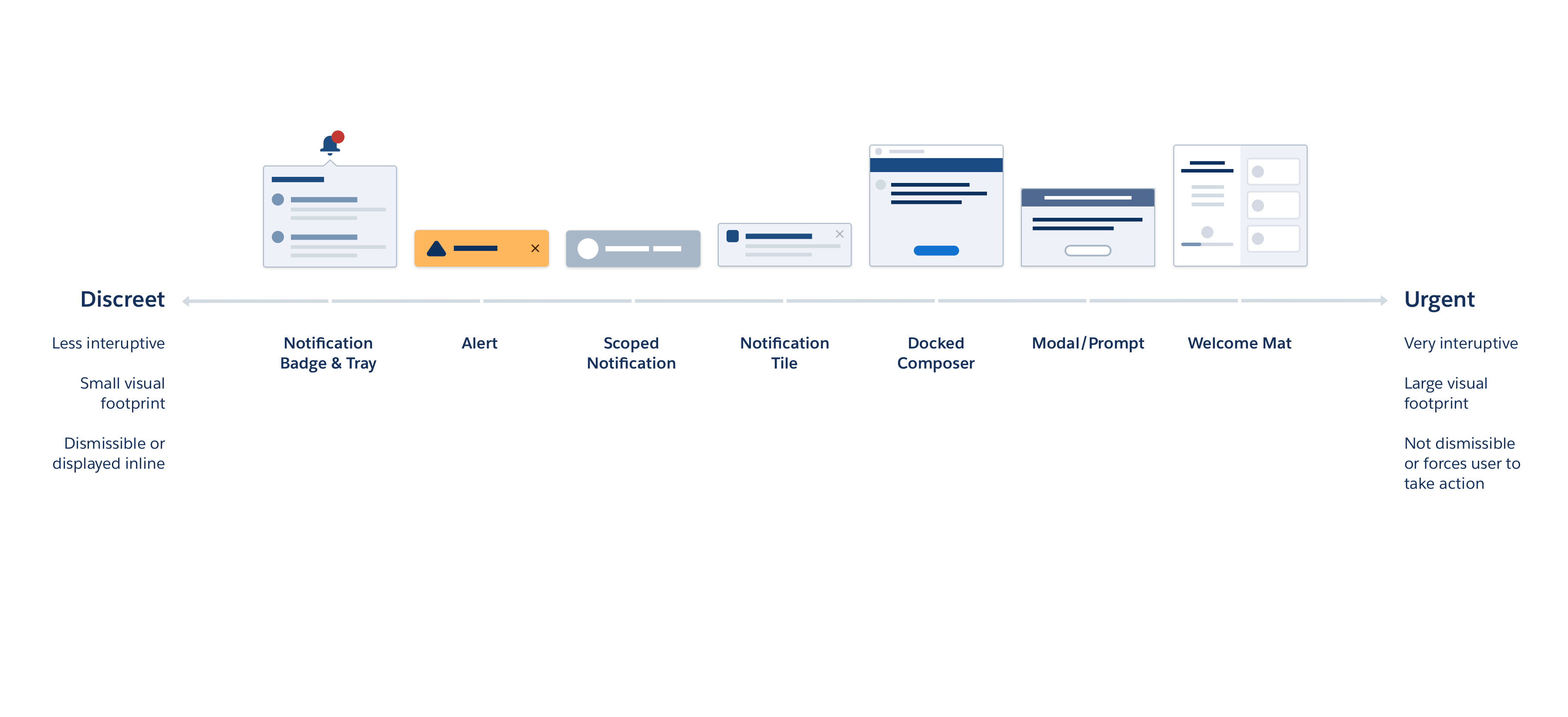
Notification Landscape
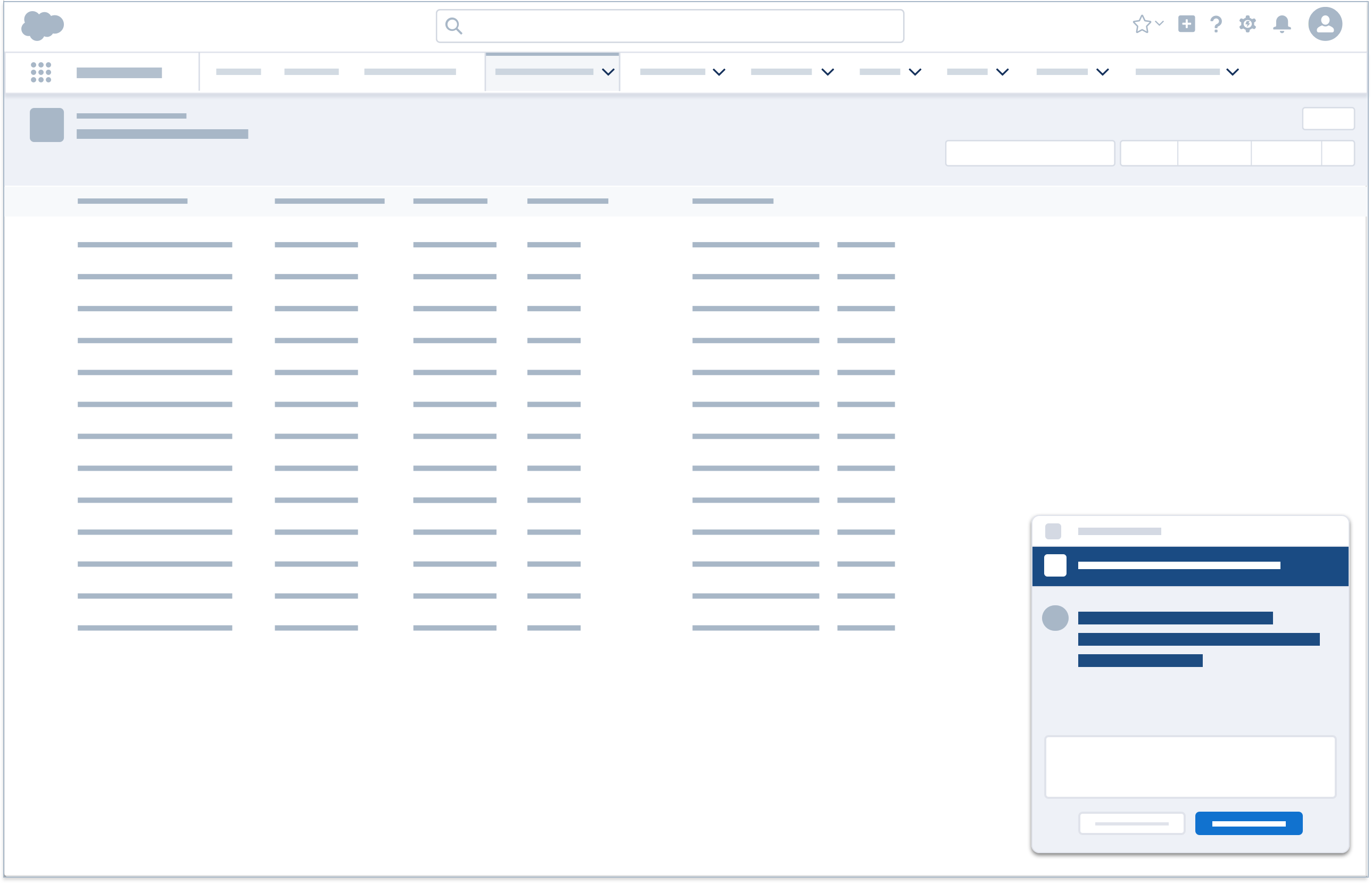
Bell and Accompanying Notification Tray
Level of Priority
Urgent, standard, and discreet delivery
Description
Clicking the bell expands and collapses the notification tray. When a new notification is delivered, an enumerated badge appears, and the count of new notifications is updated. Each notification in the tray allows the user to navigate directly to the respective item.
Component Blueprint
Stateful Button Icon (Bell)
Popover (dialog with list of notifications)
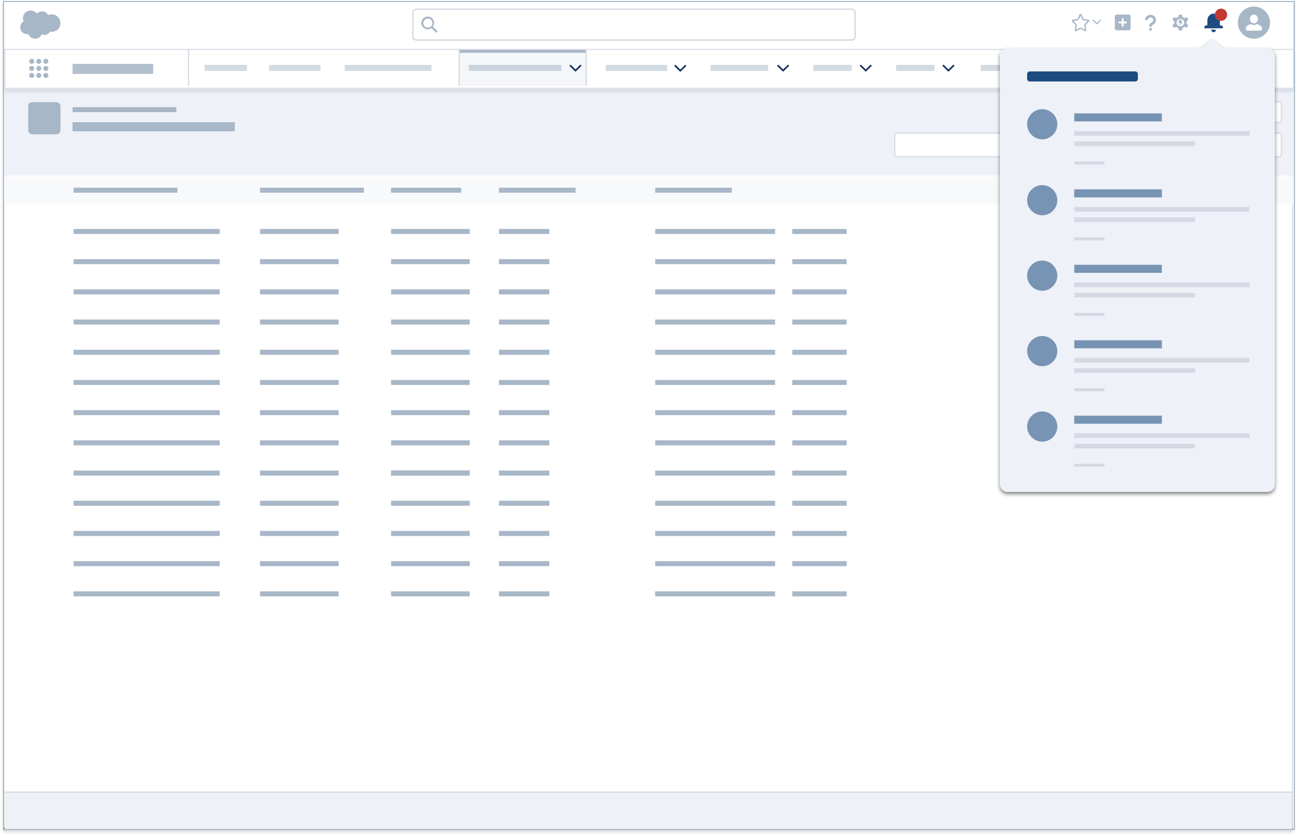
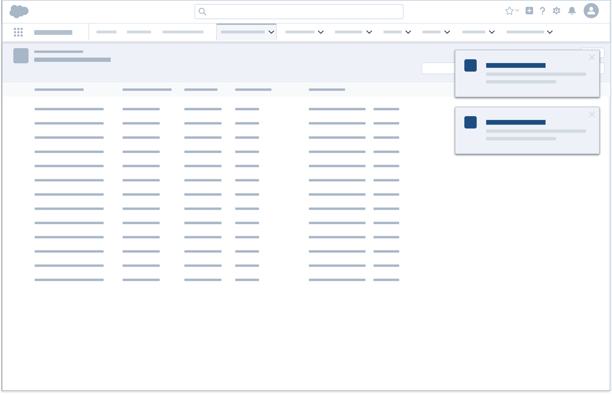
Notification Tile
Level of Priority
Standard delivery
Description
Clicking in the body of a notification tile dismisses the tile and prompts a new browser tab with its URL loaded. The tile can also be dismissed by clicking the X icon.
Component Blueprint
Stateful Button Icon (Bell)
Popover (dialog with list of notifications)
Docked Assistant
Level of Priority
Urgent delivery
Description
The Docked Composer can be expanded into a docked assistant notification, enabling the user to complete tasks or gather information via chat, dialer, or email. The notification can be minimized and docked at the bottom of console by clicking the minimize icon.
Component Blueprint
Docked Composer (for persistent UI elements)
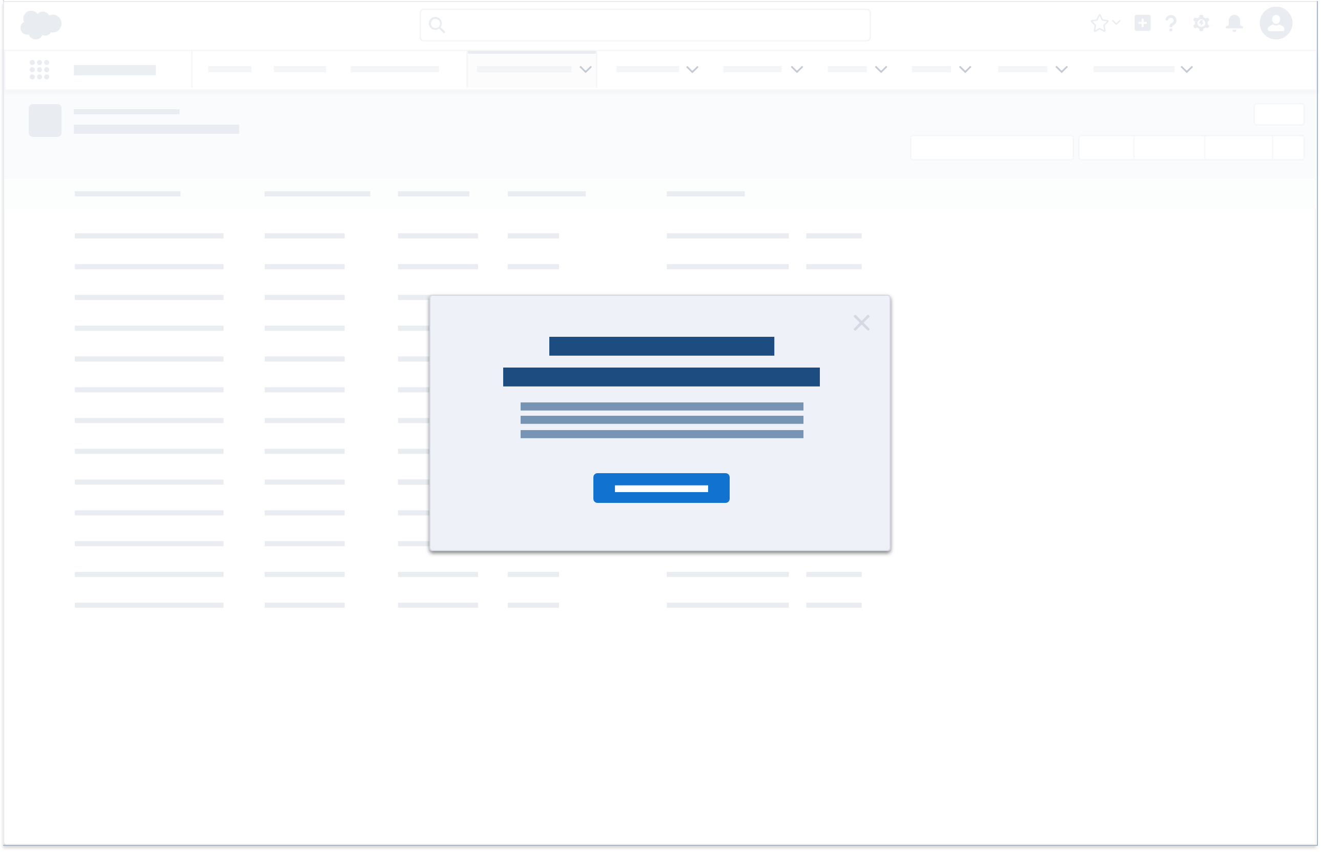
Modal/Prompt
Level of Priority
Urgent delivery
Description
Modals and prompts display information in a layer above the app. They're centered vertically within the viewport. To dismiss a prompt, the user must confirm its call to action. To dismiss a modal, the user can select the close icon or cancel button, or click anywhere outside the dialog window.
Component Blueprint
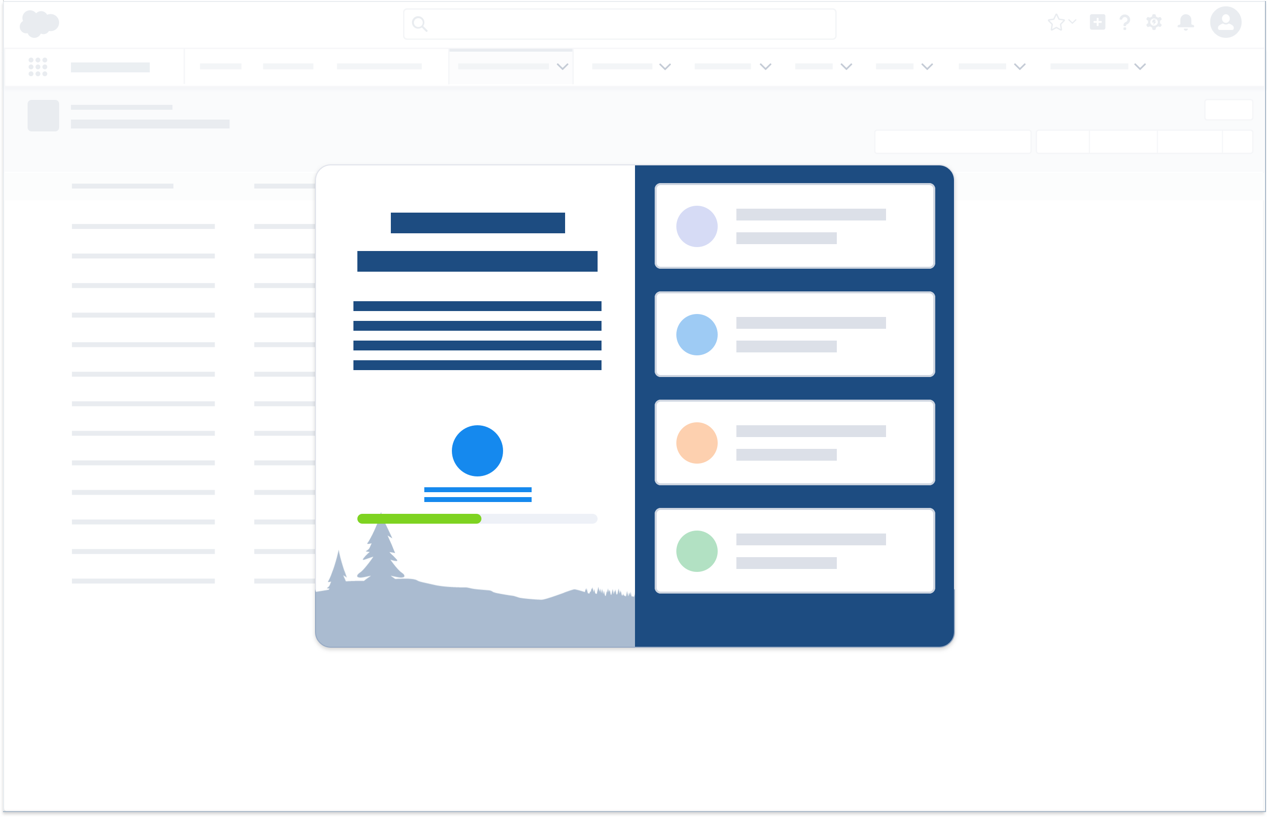
Welcome Mat
Level of Priority
Urgent delivery
Description
Like a modal, a welcome mat displays information in a layer above the app. Used mostly for educational content, it usually includes an informational left-hand pane and an actionable right-hand pane. Welcome mats may trigger walkthroughs, other modals, or videos, or direct users to URLs.
Component Blueprint
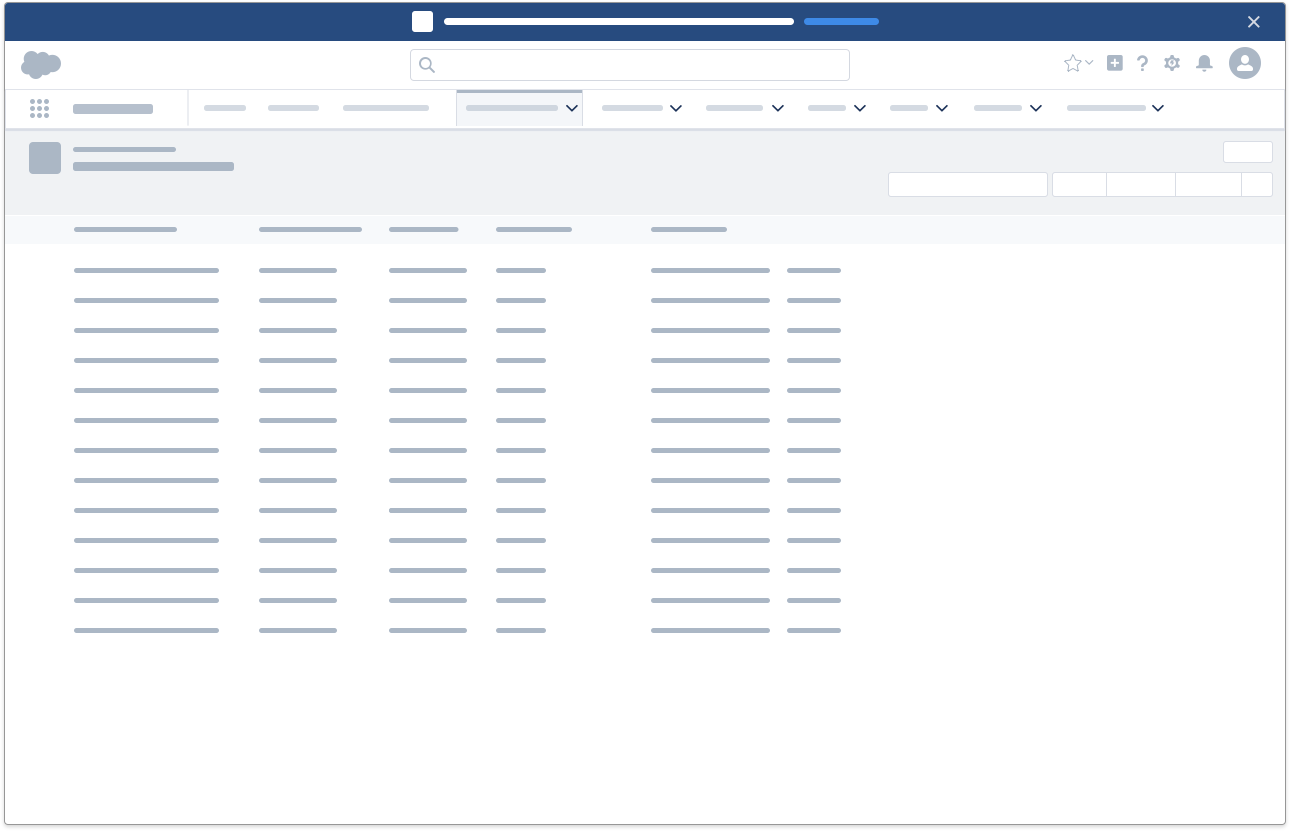
Alert Banner
Level of Priority
Standard delivery
Description
Alert banners appear without user initiation, communicating system- or page-wide states, and persisting throughout a session.
Component Blueprint
Scoped Notification
Level of Priority
Discreet delivery
Description
Scoped notifications present information not important enough to justify alerts. They can be scoped to most containers and are not dismissible.
Component Blueprint