Layout
Layout is the structure used to organize content.

Introduction
Layout is the underlying grid structure of rows and columns used to organize content on the canvas. In the simplest case, just one cell may be used for an image. A complex web page may include many underlying sections, rows, and columns, all of which behave responsively.
Layouts can be fixed or customizable. Content builders may use different layout settings and controls to meet designers’ and developers’ needs. In all cases, layout settings should map to the underlying technology used to render the final publishable output of the builder.
Start using our Design Kits
Open in FigmaUsage
A layout component establishes columns within which other components are added. Each layout component controls its number of columns and column widths.
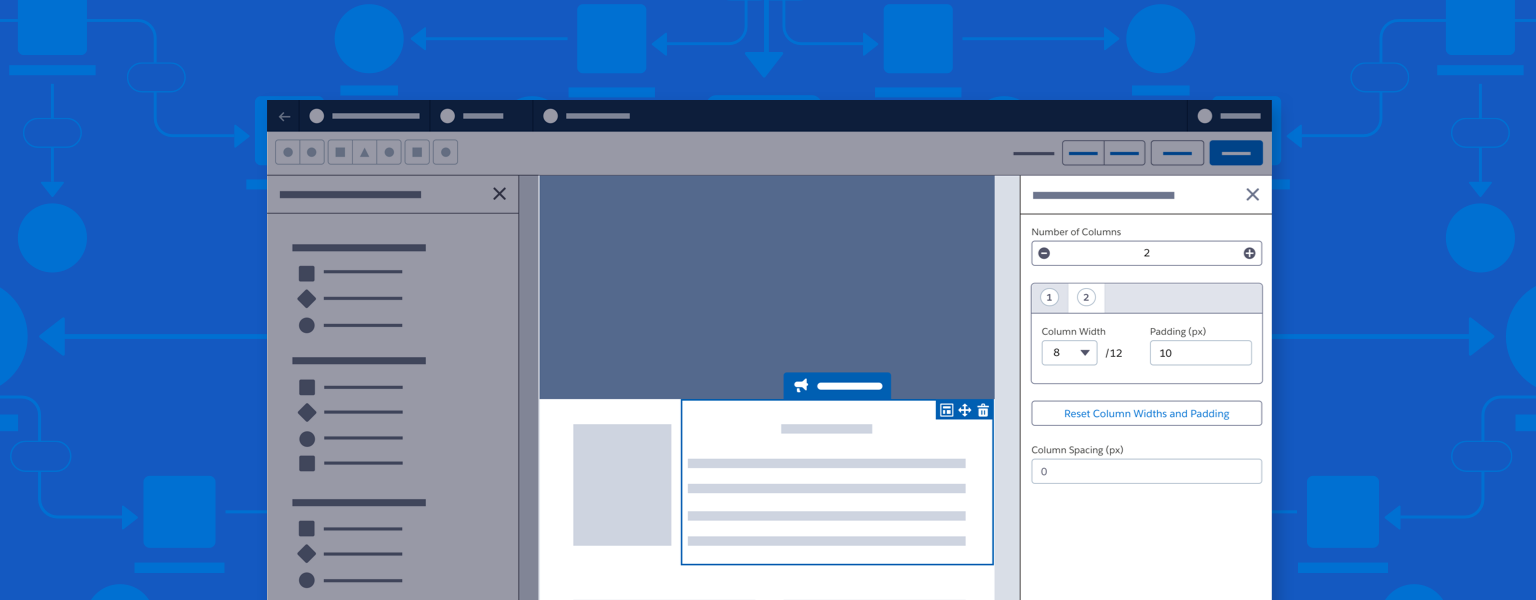
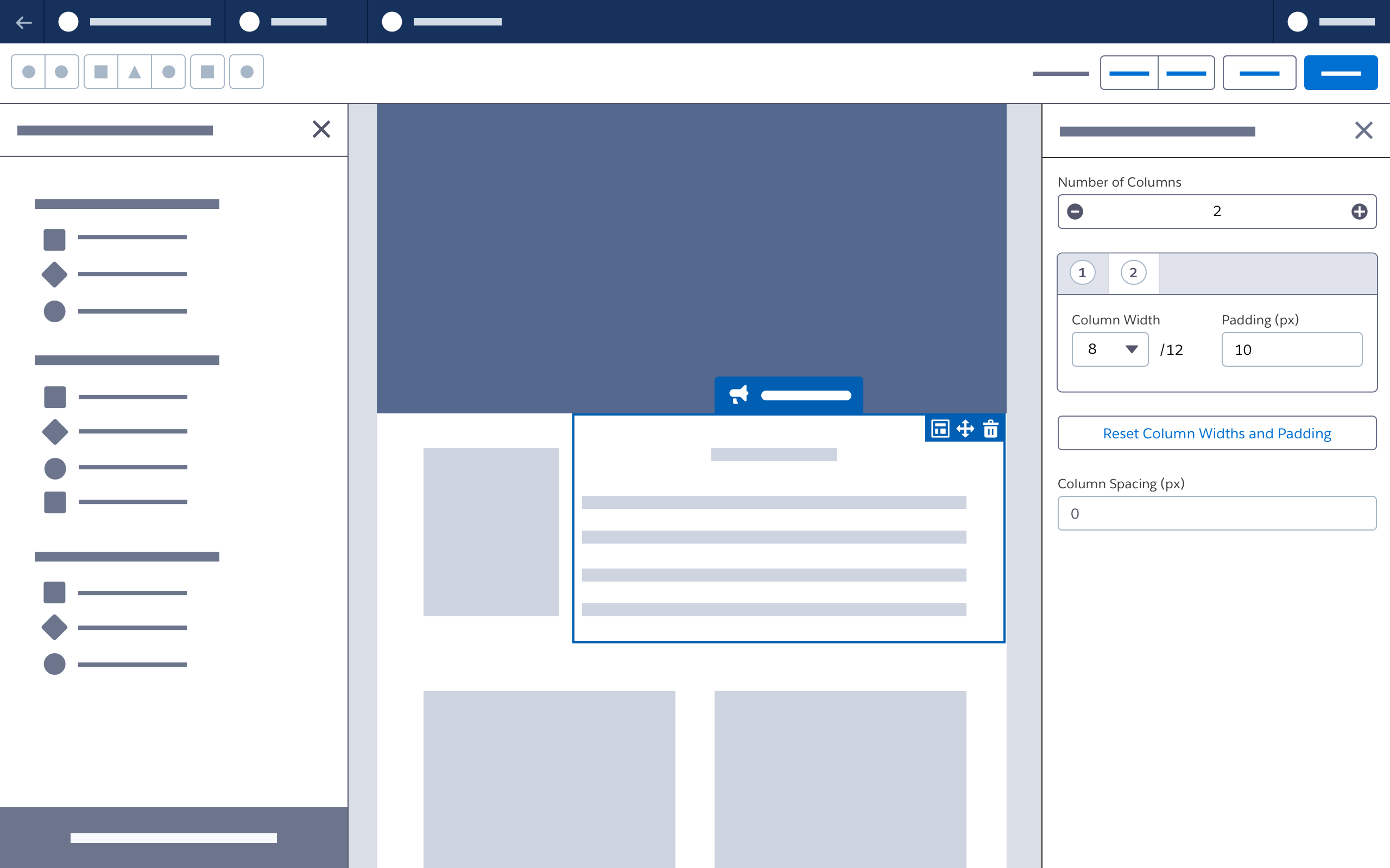
Clicking the Layout action in the drop zone container for any component opens the property panel for the underlying layout component for that row, and also opens to the specific column’s scoped tab.

Selecting Component Layout from the drop zone container: Clicking this button on any component opens the property panel for the underlying layout component, and makes the specific column’s scoped tab active.
Selecting Component Layout from the component property panel: Each non-layout component has a menu link that opens the property panel for its underlying layout component.
Selecting a different component when editing layout: If the user selects a different component on the canvas or from the tabs in the layout editor, the new component or column is selected on the canvas, and the accompanying tab opens in the layout editor.
Deleting a column with content: A confirmation modal will confirm before deleting a column with a component.
Layout Settings Panel
Columns
Any new settings applied to an entire row should be added to the layout settings panel outside the scoped column tabs. Add settings for a specific column inside its scoped tabs.
Set number of columns: Use the input to set the number of columns, from one to twelve, for the row. Updating the column number updates the canvas and the scoped tabs. Reducing the number of columns removes the rightmost column(s). If any column to be deleted has existing content, confirm deletion with a modal.
Set column width and padding for each column: In the scoped tab for each column, adjust column width (based on a 12-column grid) and padding (in pixels). Updates to column width and padding should be immediately reflected on the canvas.
Change column size: When column sizing changes, change the value of the column immediately to the right, relative to the new selection.
- If this action will result in a column having a value of 0, reduce the width of the next column to the right.
- If selecting the rightmost column, change the value of the column immediately to the left.
- If this action will result in a column having a value of 0, reduce the width of the next column to the left.
Reset column widths and padding: Click the button “Reset Column Widths and Padding” to return to defaults (evenly sized columns with no padding). Disable this button when there is only one column.
Set column spacing in pixels: Update Column Spacing to set spacing between all columns.
Style
Set column alignment: Update Column Alignment to set vertical alignment of content to the top, middle, or bottom of a column.
Set row background color: Update Background Color to set the background color of a row using the color picker.
Next: Modals