Our Color System
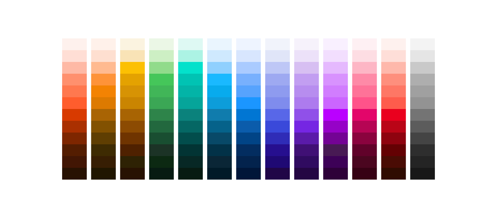
The Salesforce color system unites the variety of solutions necessary for scale. Using a single-source color system provides opportunities to automate decisions and evolve them with flexibility.

The Numerical Color System
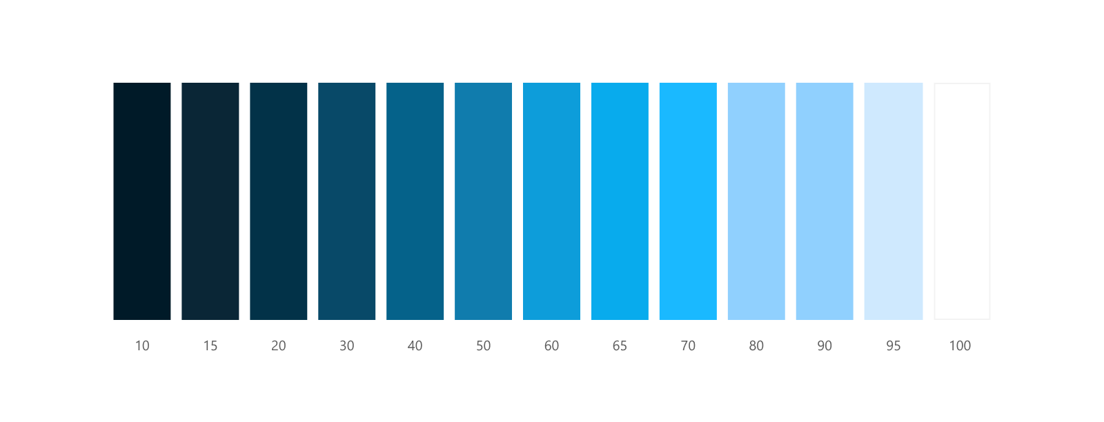
Color solutions for accessibility are built into our color system. Each color’s tones are given a value that ranges from 0 through 100. In this color system, 100 points (points) is white and 0 points is black. The full spectrum of the color, ranging from 0 to 100, makes up a color lane. Each color in this system, and within each lane, is assigned a number, such as the 15 in Cloud Blue-15.
Color steps are the 5- to 10-point increments that make up a color lane. They help define a color pattern that can be replicated across hues. Colors share horizontal values across hues, using the same system vertically within each monochromatic palette. This way, rules can be replicated across all color lanes in our system using color steps.

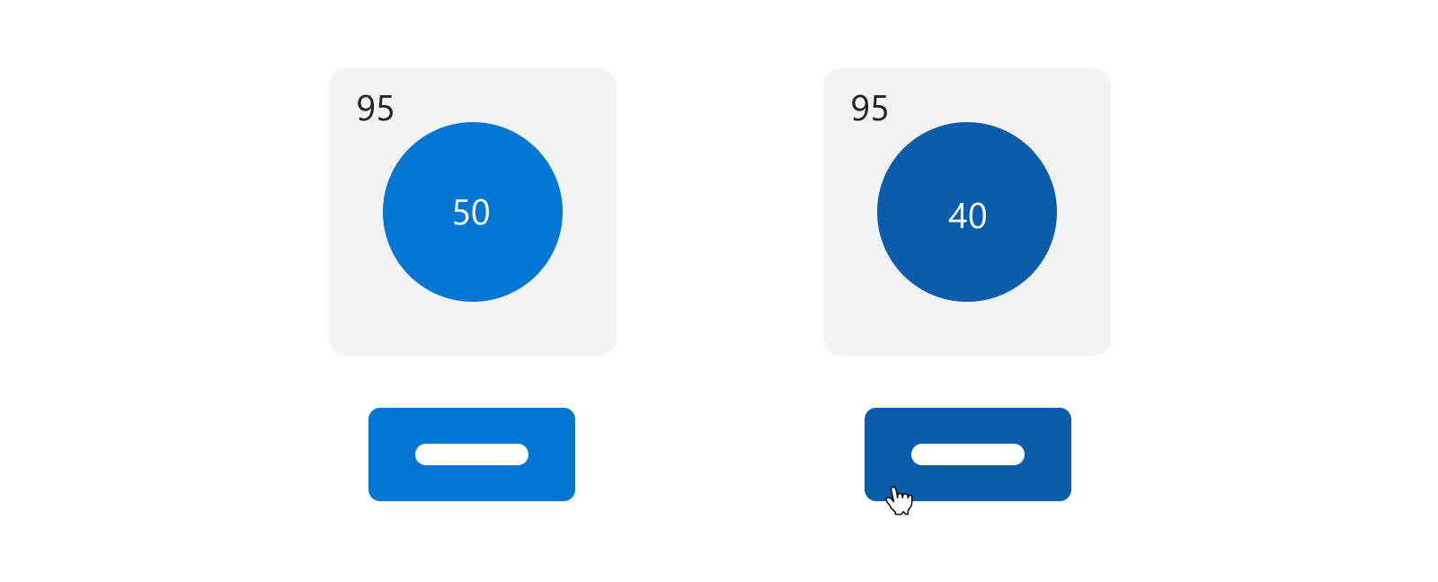
Applying this approach eliminates any need to use a contrast ratio checker tool. The magic numbers in this system are 50 points and 40 points. If two colors are 50 points away from one another, they meet 4.5:1+ contrast ratio compliance. If they’re 40 points away from one another, they meet 3:1+ compliance. This method also works across alternate hues.
For example, button backgrounds are required to meet a 3:1 contrast ratio or higher on the background the container sits on top of, which is a 40 points difference. In this example, the button background is 50 points, and the hover state is 40 points, so both values are compliant on the 95 point gray page background. And we can use this 10 point step, from 50 to 40 points, across all color lanes for hover states.

Note: The term "magic numbers" as referenced in the these Color Guidelines derives its origins from the U.S. Web Design System (USWDS). This concept is employed to describe the color steps and patterns integrated within the Salesforce Color System. The USWDS is acknowledged for coining this term, which has been adopted and further developed within the context of the SLDS Guidelines. It signifies a structured approach to color progression and harmony, contributing to the visual cohesiveness and usability of Salesforce's design ecosystem.
To learn more about how to apply the magic numbers, visit Color Accessibility. Additionally, to find all the tools you need to work with and learn about Salesforce Lightning Design System, visit our Tools Overview page.
Color Relationships
Colors that touch or interact with each other have important relationships, including adjacent colors, visual states, and transparencies. Keep these relationships in mind to create a cohesive color experience.
Adjacent Colors
Adjacent colors influence perceivable contrast between two visual elements. They may indicate a border, or delineate an input or objects next to one another and their background from the rest of the page.
In this example the icon’s orange background is the adjacent color to the icon symbol. And the white background color is the adjacent color to the icon’s orange color. These adjacent colors define the visual boundary, which defines the edges of the input or control. Visual boundaries convey the component’s identity and indicate the touch or click target area for interacting with it.

Visual States
State colors give users visual feedback for the actions they take, like a button getting darker to indicate hovering. As shown in the example image, the main types of visual states are:

Color contrast guidelines for state changes are often hard to meet for complex interactions because of the number of colors that must contrast with each other. To meet guidelines easier, supplement color choices with other visual indicators, like labels and alt text. Sometimes, state changes can be indicated by other means, including cursor changes. For more information about accessible visual labeling, see Accessible Web Design Guidelines.
Transparencies
Only use transparencies for decorative UI, never for functional UI. With transparencies, the numbers system no longer applies, so you can't quickly determine if something is color contrast compliant. To keep your experience accessible to all, use transparency sparingly, and manually check contrast ratios.
Resources
- Creating Color Contrast Guidelines to Meet WCAG 2.1 and Beyond
- Do You Know How to Design with Color Contrast? Quiz Yourself to Find Out
- Are My Colours Accessible
- Introducing the Salesforce Color System
- The A11Y Project
- Web Accessibility Initiative: Making the Web Accessible
- Web Accessibility in Mind
- Salesforce Design Accessibility Topics
- Salesforce Disability Topics