Canvas
Guidelines
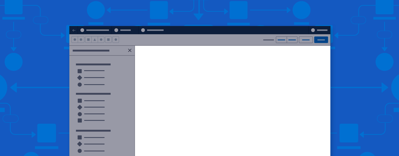
A canvas is the main work area in a builder—where users create and work with visual data.
Introduction
The canvas is the main working area of a builder layout, and occupies the bulk of UX real estate. Here users can add and manipulate components, nodes and connectors, or data elements.
Start using our Design Kits
Open in FigmaUsage
The canvas provides a visual representation of the content, app, or process a user is building. Users create, configure, and save that representation using UI controls in the header, panels, or the canvas itself.
Accessibility Note: When building a canvas solution, partner with engineering to specify and implement both keyboard and mouse controls for all canvas interaction.
Canvas Navigation
With large flows or content, users need a way to navigate around the canvas. Options include a zoom tool, scrollbars, and search functions or hierarchical component lists that let users jump to a chosen node or component.
Canvas Scaling
Canvas scaling and navigation are critical aspects of builder UI. Scaling may be expressed in terms of window size, panel configuration, or magnification. Elements should scale smoothly and quickly, with guardrails on scaling size.
Canvas Guides and Grids
These options can add structure to a layout. Controls or settings can let users enable, disable, show, hide, and otherwise configure a grid or guides.
Canvas Actions
Users should be able to add, move, edit, and delete elements on the canvas. Methods for adding include create actions in the header or panels, drag and drop (from a panel), and click to create (from within the canvas). In one common pattern, users select a component or node on the canvas, then open a property configuration panel.
Canvas Views and Modes
Put controls for toggling canvas views—for example, desktop/mobile views of an email or design/code views of a webpage—in the header toolbar. The header is also a good location for mode change controls. A mode change—say, a dynamic data preview mode—commonly exists as a new layer or modal over the existing canvas.
Canvas for Logic Builders
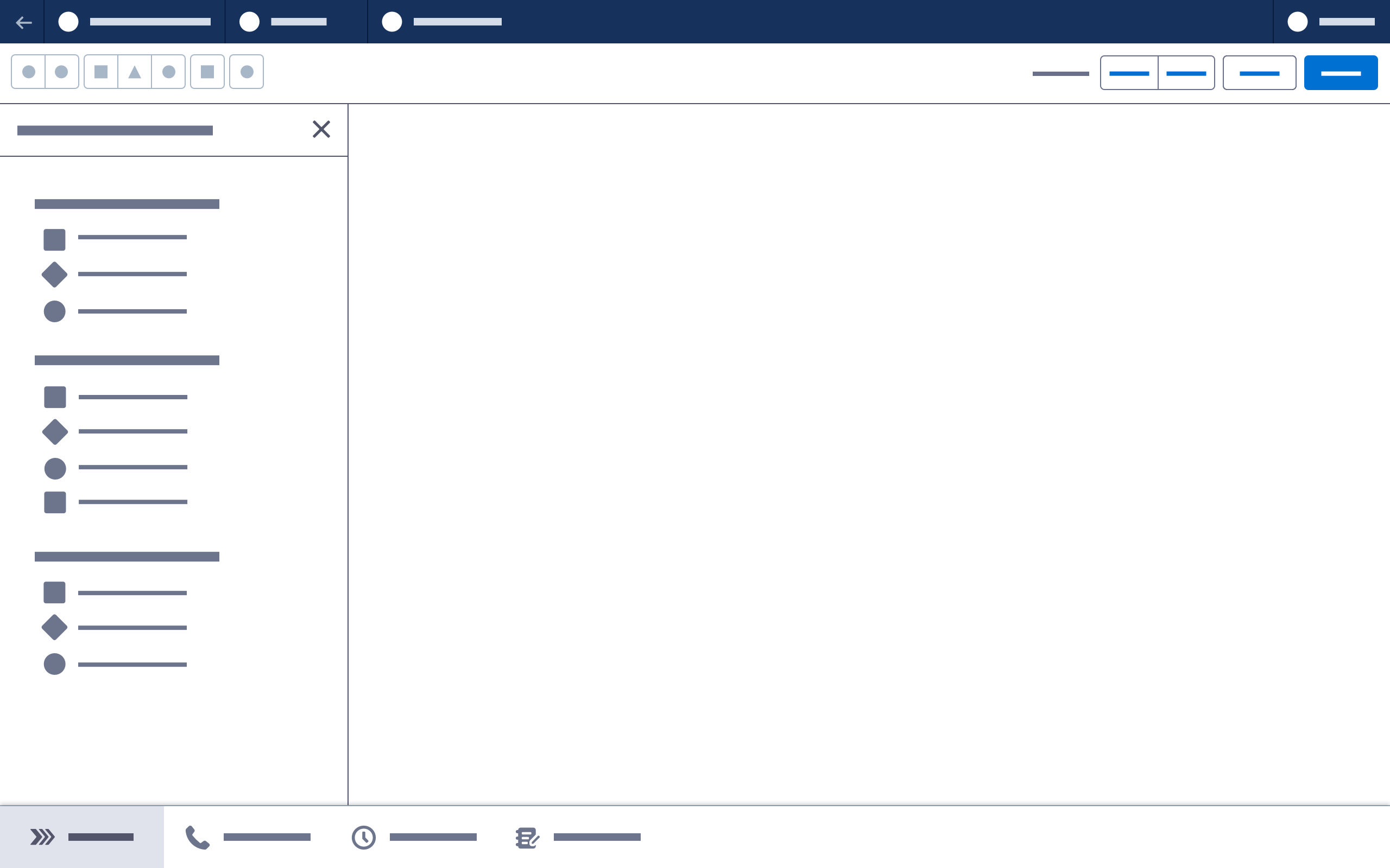
In logic builders, the canvas is used to create a visual flow or step sequence. Nodes, steps, or entities listed in the left side panel may be added to the canvas with a creation method such as drag and drop or click to create.
On the canvas, use connectors to represent relationships between nodes or a sequence of events. Click nodes or connectors to access more information or configure elements.
Parts
Nodes
Nodes are the building blocks of a workflow. Each node represents an action.
See Nodes for more information
Connectors
Connectors are lines that connect nodes, representing relationships and movements between them.
See Connectors for more information
Creating Elements on the Canvas
Drag and Drop
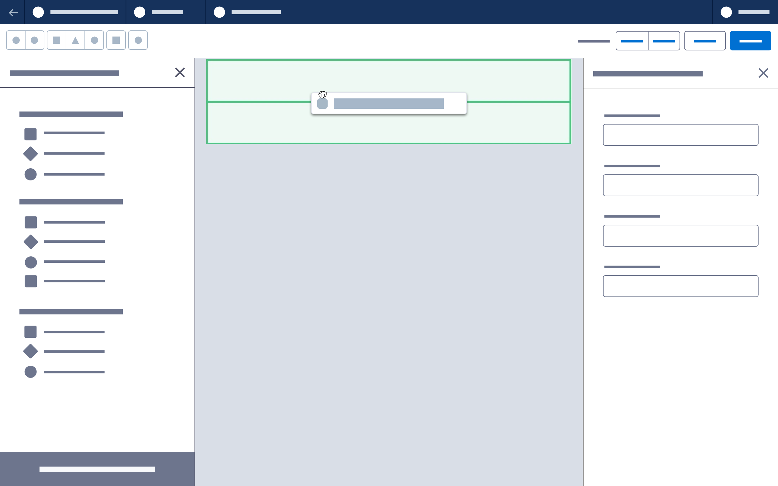
Users drag and drop nodes or other elements from a toolbox/component panel to the canvas. This method may also be used to move or connect elements on the canvas.
See Drag and Drop for more information
Click to Create
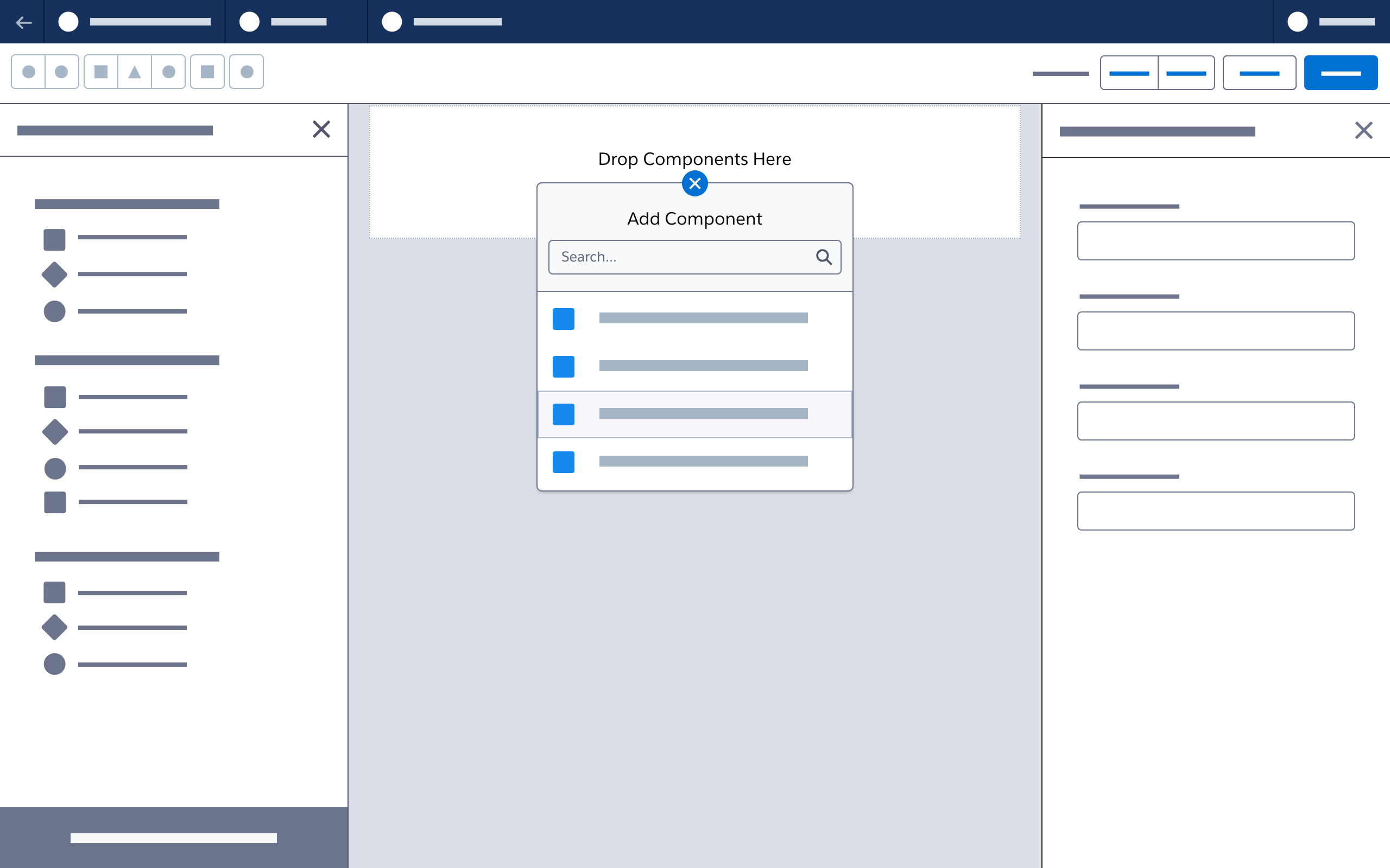
Here, users click to create nodes or other elements. Clicking directly on the canvas or on dedicated creation points opens a popover with contextual options; the selected option is added to the canvas.
See Click to Create for more information
Working on the Canvas
Zoom Tool
The zoom tool is recommended for logic builders so the canvas view can be adjusted and scaled to see all or part of a flow.
See Zoom Controls for more information
Canvas for Content Builders
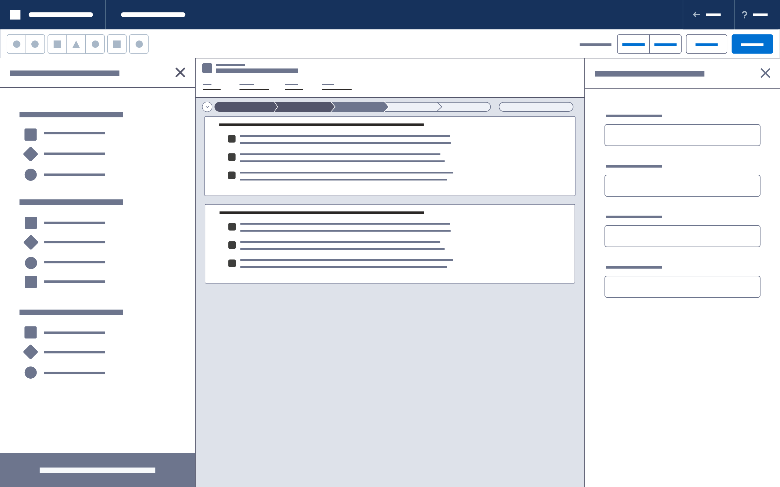
In content builders, the canvas is used to construct a visual representation of a content type, such as a web page, email message or social post. Components listed in the left side panel may be added to the canvas using drag and drop, click to create, or keyboard interactions.
On the canvas, use layout components to organize and structure the content. Components in a drop zone use a drop zone container to highlight and label selected components. Button icons are used to perform actions such as moving or deleting a component. Select a component to open its property configuration panel.
Parts
Component
Components are content building blocks. On the canvas, they provide a WYSIWYG representation of a configuration. For example, an image component displays a selected image on the canvas at the correct size, while a rich text component displays accurately formatted and styled text. Until they are configured, components in the drop zone container display a default state.
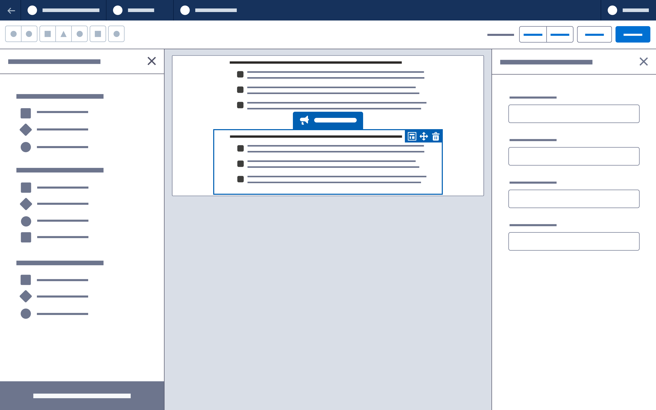
Selected components are highlighted, and their property configuration panels opened. Any additional actions are shown as icons on the right side of the component drop zone container.
Layout
Layout is the underlying grid structure of rows and columns used to organize content on the canvas. In the simplest case, a single cell may hold an image. A complex web page may include underlying sections, rows, and columns, each of which behaves responsively.
Layouts can be fixed or customizable. A content builder may include settings and controls that let users create custom layouts. Layout settings should always map to the underlying technology used to render the builder’s final output.
Layout components establish the sections, rows, or columns that will contain other components. They control factors such as number and size of columns, margins, padding, background colors, and border styles.
See Layout for more information
Creating Content on the Canvas
Empty State
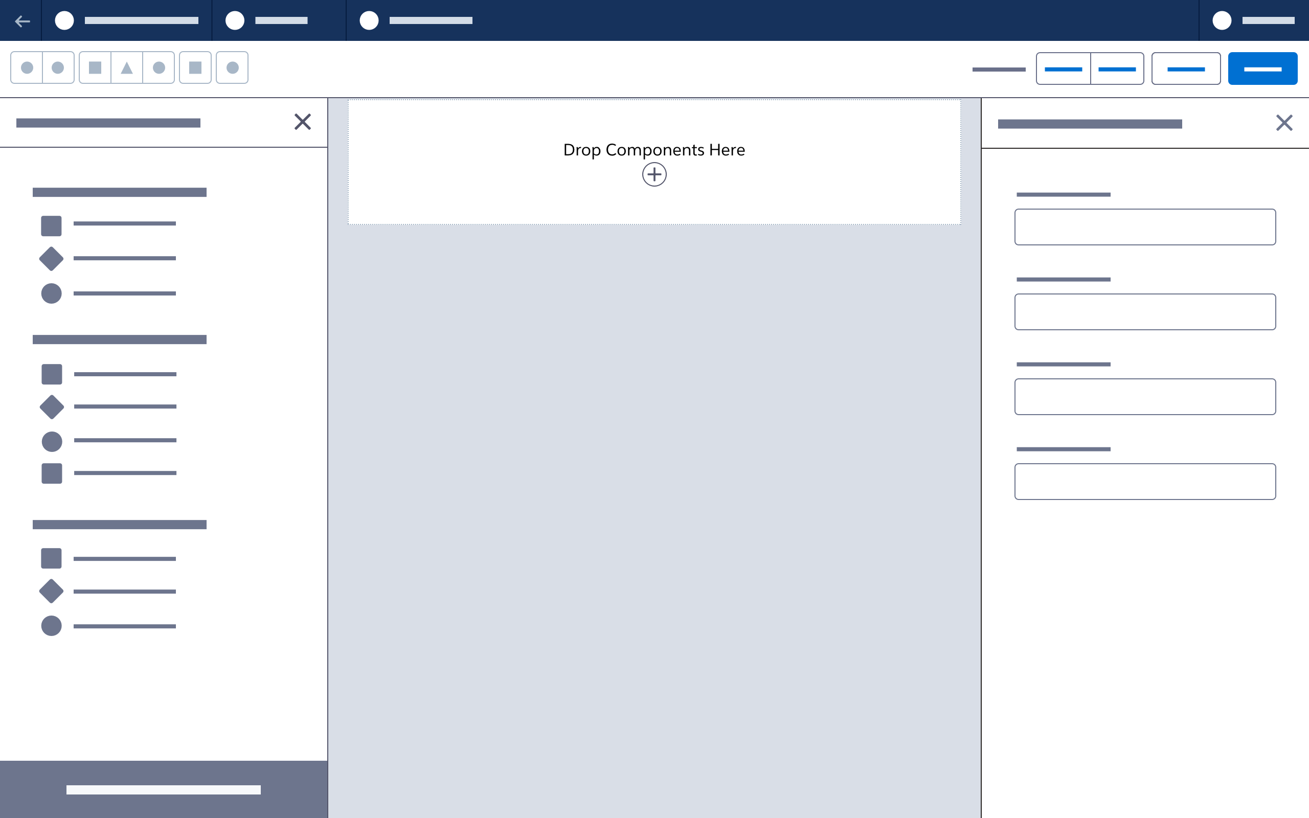
By default, a canvas has a nonselectable one-column row—the only layout component that another layout component can be dragged on top of. The purpose of this empty row is to help users understand how to get started.
Document-level settings can be made immediately available when a user creates a new content record.
Drag and Drop
Drag and drop enables users to select a component and drag it onto the canvas, targeting a drop zone above, below, or within existing content.
See Drag and Drop for more information
Click to Create
Here users click (or use a keyboard) to open and choose from a contextual list of components that can be added in a selected position.
See Click to Create for more information
Working with Components on the Canvas
Select
Selecting a component on the canvas highlights its drop zone container and opens the property panel
Move
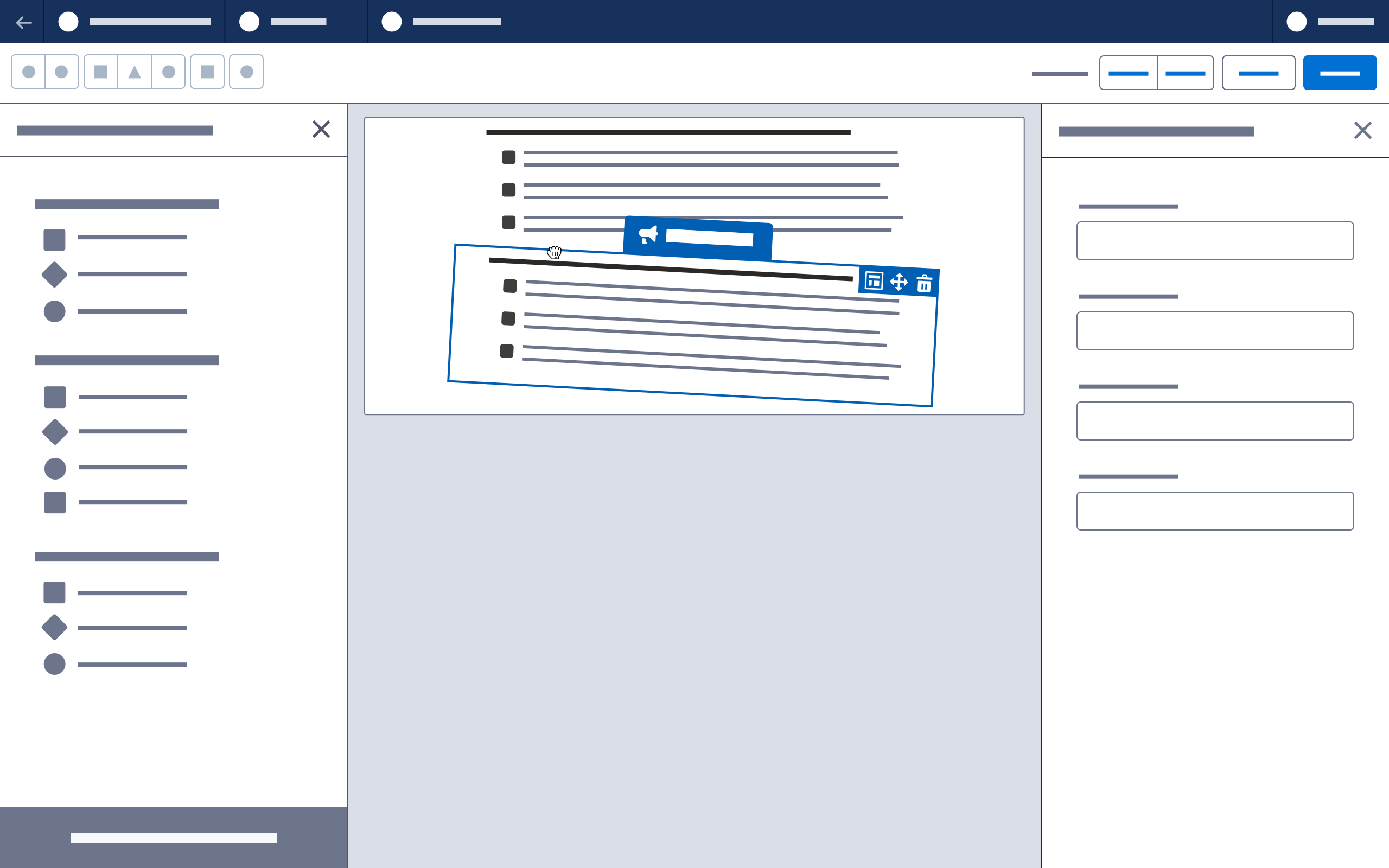
Clicking Move in a component’s drop zone container lets the user drag and drop that component anywhere on the canvas. Selecting the Move icon with the keyboard enables a similar "move mode," in which the arrow keys are used to select and move a component.
Delete
Clicking or selecting Delete in a component’s drop zone container prompts a confirmation modal before deleting the component. If the selection is a layout component and the row has content, include details in the confirmation modal about the rows, columns or content to be deleted.
Layout
Clicking or selecting Layout in a component’s drop zone container opens the property panel for its row’s underlying layout component, along with its column’s scoped tab.
See Layout for more information
Next: Click to Create