Configuration
A builder is made up of a set of parts that can be configured to meet the needs of an application, business process, or content type.
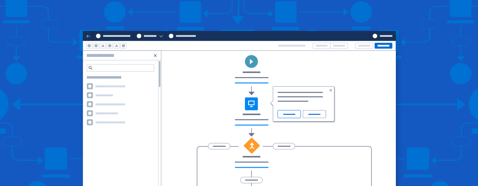
Introduction
When creating a new builder, start with a builder type, then make design choices that support its use case.
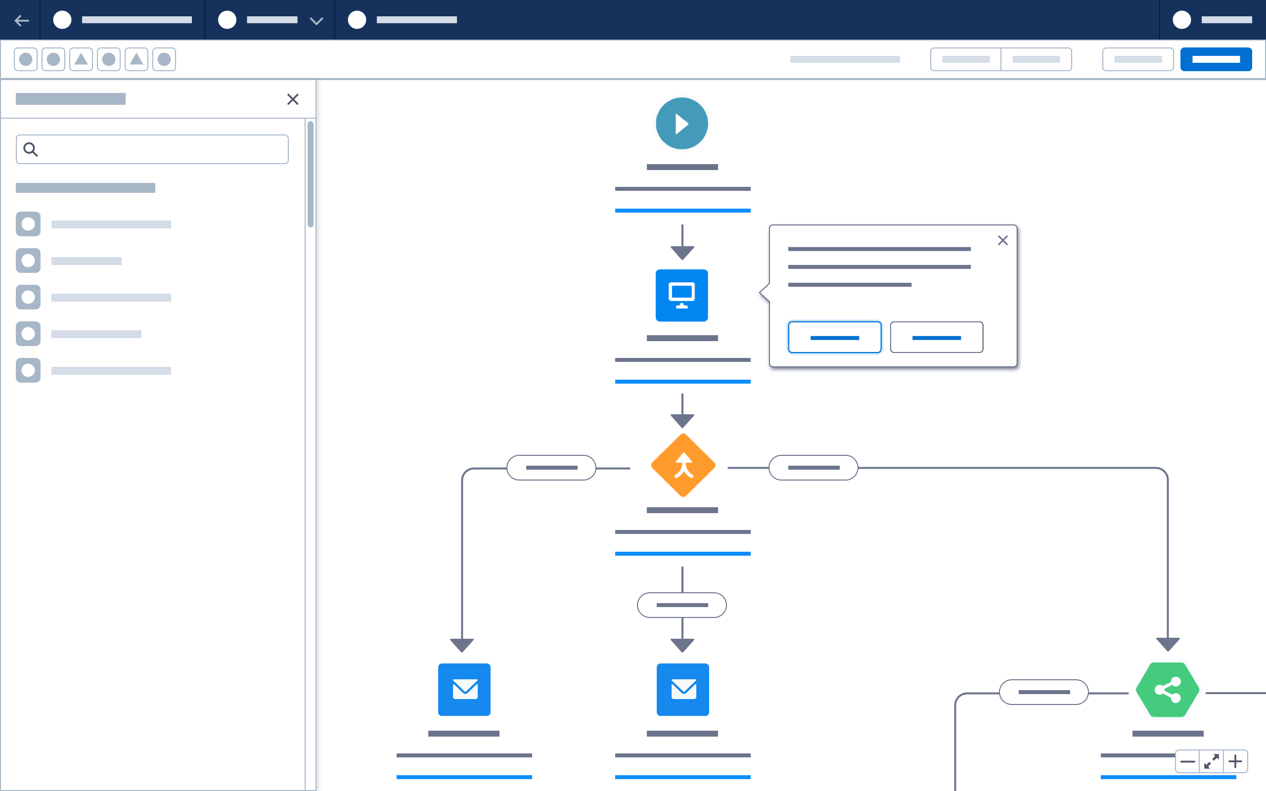
Use a logic builder to visualize a business process, flow, or sequence of events. Logic builders often feature nodes and connectors representing relationships between entities on a canvas.
Use a content builder to lay out and configure web pages, messages, ads, social posts, and images. Content builders often feature configurable components that can be arranged in static or dynamic layouts on a canvas.
Use a data builder when creating reports and presentations featuring data tables, charts, or graphs.
Use a code builder if you are working mostly with code views or database schemas.
After identifying the most appropriate builder type, look at key use cases. What actions are needed in the header, and which is the primary action? Which tools and components will be used with the canvas? Which panels and interactions support creation and configuration?
Start using our Design Kits
Open in FigmaBuilder Parts
A builder is made up of a set of parts, some common and others unique to specific builders. Required and optional builder parts are documented in the patterns section; those with ready-to-use markup link to SLDS component blueprints.
Every builder must have a builder header and a toolbar—elements that indicate that users are in a builder. Almost all builders focus on a canvas or open work area, which is used to add and configure elements such as content components, nodes and connectors, or data.
In addition to these requirements, a builder can include one or more panels, modals, or popovers, which are used to configure items on the canvas. Optional patterns include canvas zoom, canvas click to create, drag and drop, panel drill in, and validation.
| Required | Required for Logic Builder Only | Required for Content Builder Only | Optional |
|---|---|---|---|
| Builder header | Workflow connections | Components | Panels |
| Builder header toolbar | Nodes | Panels | Modals |
| Canvas | Popovers | ||
| Click to create | |||
| Drag and Drop | |||
| Validation | |||
| Zoom tool |
Logic Builders
A logic builder requires a canvas, workflow connectors, and nodes. Logic builders include Flow Builder, Engagement Studio, Journey Builder, and Process Builder.
Consider the following when configuring a logic builder header:
- How is the builder launched, and where does the 'Back' button return the user to?
- What is the primary action? Will both Save and Activate be required for this builder?
- What settings, guardrails, and help options exist?
- What actions should be included in the toolbar?
- Will search be supported?
- What validation types (errors and warnings) will be surfaced to the header?
Consider the following when configuring a logic builder canvas:
- What types of elements (nodes) will be used?
- What relationships between nodes are required?
- How will elements be added to the canvas? How will they be edited, moved, and deleted?
- Will elements be arranged in a fixed grid or positioned ad hoc on the canvas?
- How many elements will be needed to represent a common process or flow?
- How will the user move around or scale the canvas?
- How will canvas elements be named and configured? Is a popover, panel, direct edit, or modal the best way to edit element details?
- How will the user accomplish all of these tasks using different inputs (ie. keyboard not mouse, screen reader, etc)?
Content Builders
Content builders have several required parts: a canvas, components, and panels. Content builders include Lightning App Builder, Experience Builder, Page Designer and Email Builder.
Consider the following when configuring a content builder header:
- How will the builder launch? Where will the back button return to?
- What is the primary action? Will both Save and Publish be required for this builder?
- What settings, guardrails and help options exist?
- What actions will be included in the toolbar?
- Will toggles be used to show/hide panels or to change the view (e.g., from desktop to mobile)?
- Will search be supported?
- What validation types (e.g., errors and warnings) will be surfaced to the header?
Consider the following when configuring a content builder canvas:
- What component types will be used?
- Will the builder support third-party components?
- What layout structure types will be supported?
- How will components be added to the canvas, and edited, moved, and deleted?
- What size and shape is the content?
- Does the workflow require a full-screen or responsive canvas?
- Are other view modes, such as code view, text view, or dynamic preview, required?
- How will the user move around or scale the canvas?
- How will canvas components be named and configured? Is a popover, panel, direct edit, or modal the best way to edit details? Will inline editing be used for any rich text areas?
- Will versions be supported?
- How will the user accomplish all of these tasks using different inputs (ie. keyboard not mouse, screen reader, etc)?
Choose a fixed or flexible panel configuration depending on content type.

Fixed Panels
Note: Fixed panel configuration is the default approach for content builders
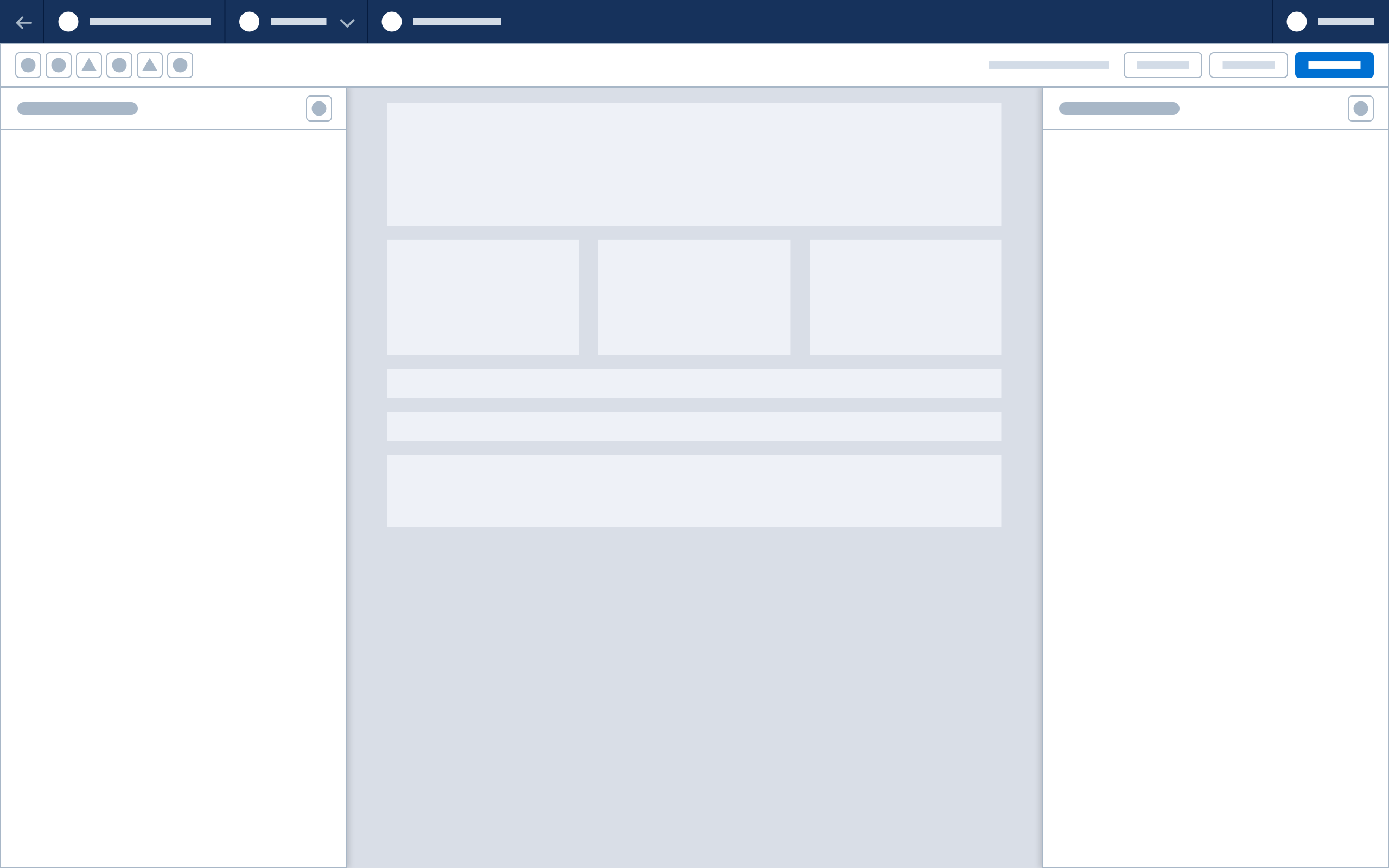
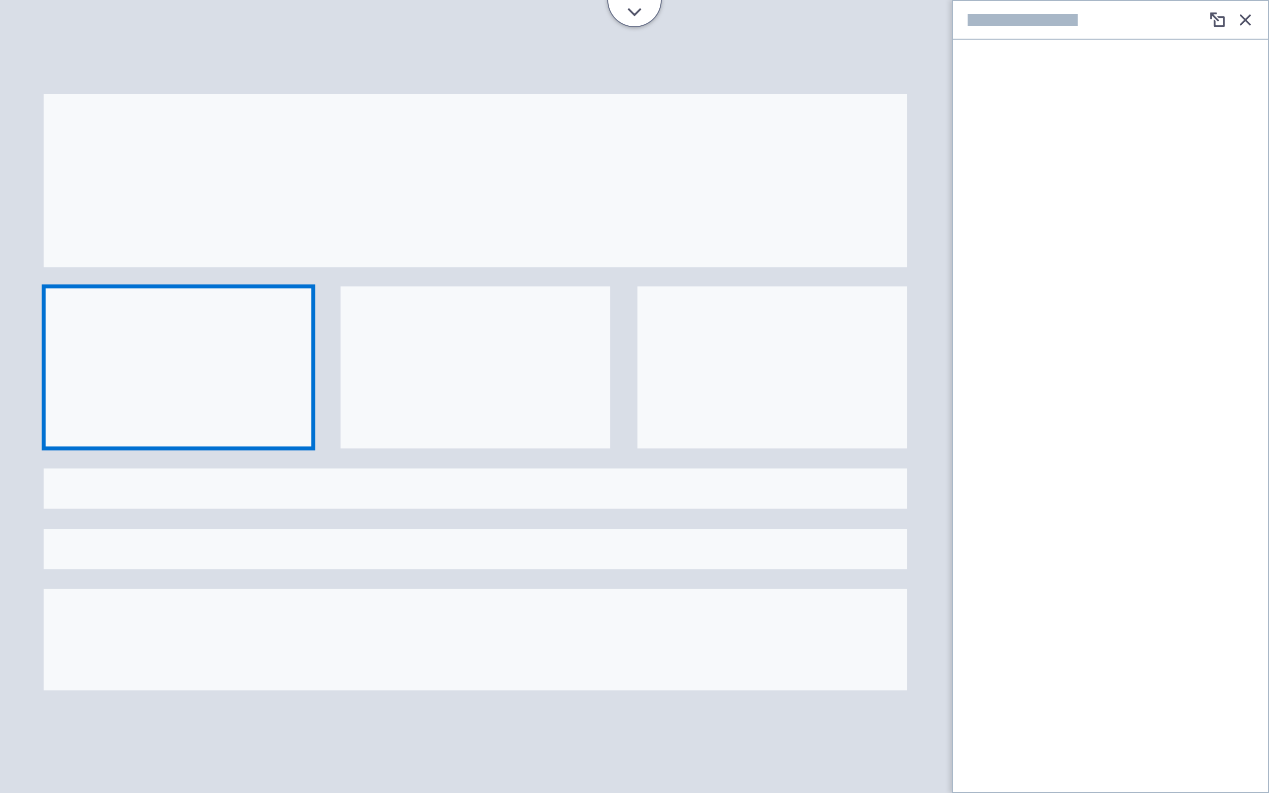
This configuration features fixed left and right panels, with the canvas scaling to fit between them. If a panel is closed or toggled off, the canvas resizes to fit the available space, up to the full width of the window. Fixed panels give users easy access to components or tools on the left and a persistent property sheet on the right. Fixed-panel content builders include Lightning App Builder and Email Builder. Fixed panels are:
- Ideal for content that is small in size, or can be scaled without affecting clarity or efficiency
- Good for workflows requiring complex configuration in panels, or where there is little reason to remove panels from the working view
- The best choice if the entire canvas must be visible during configuration, as panels never overlay the canvas
Flexible Panels
Note: Flexible panel configuration and floating panels should only be used in Experience Builder, Commerce Page Designer, or other web page content builders.
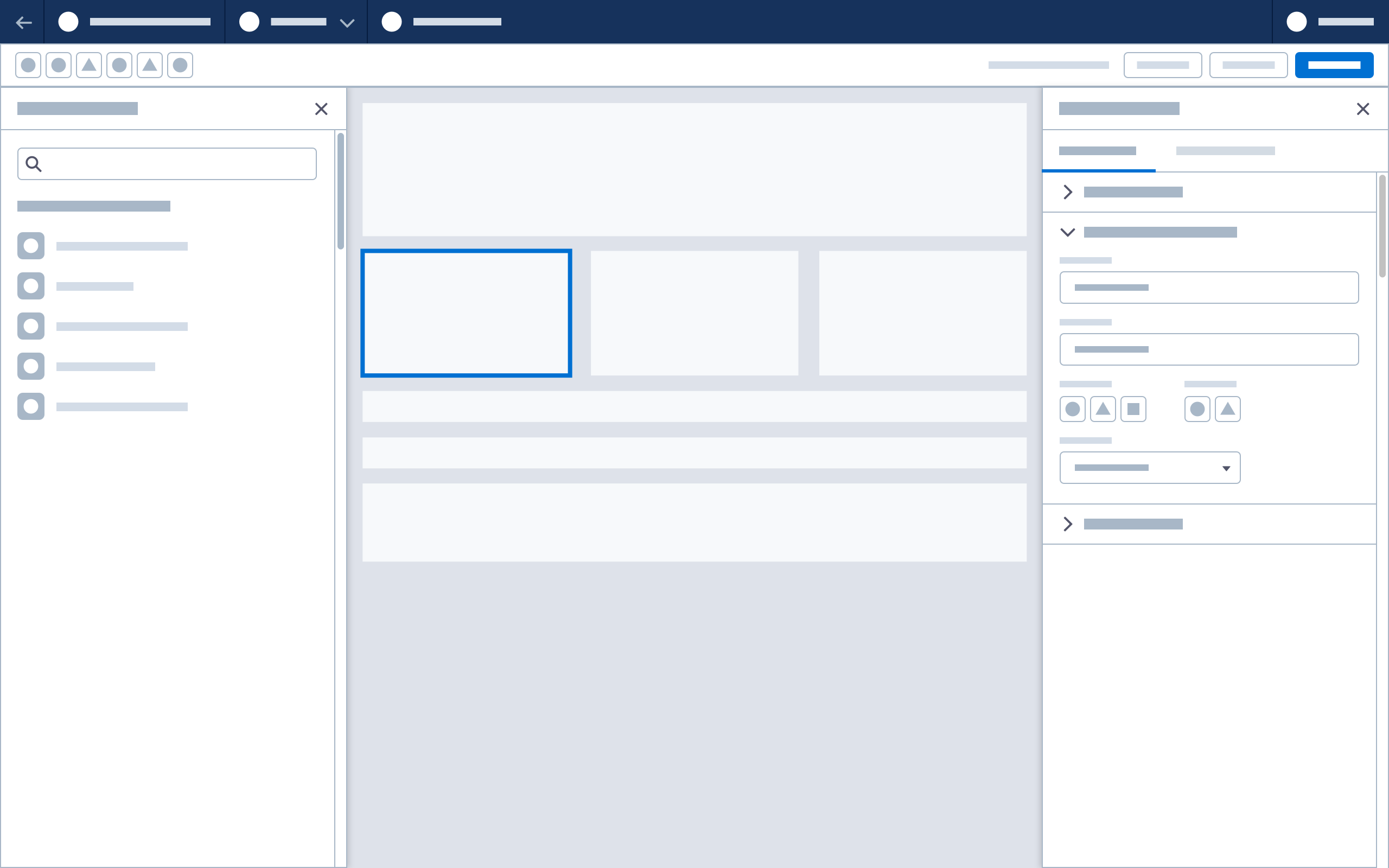
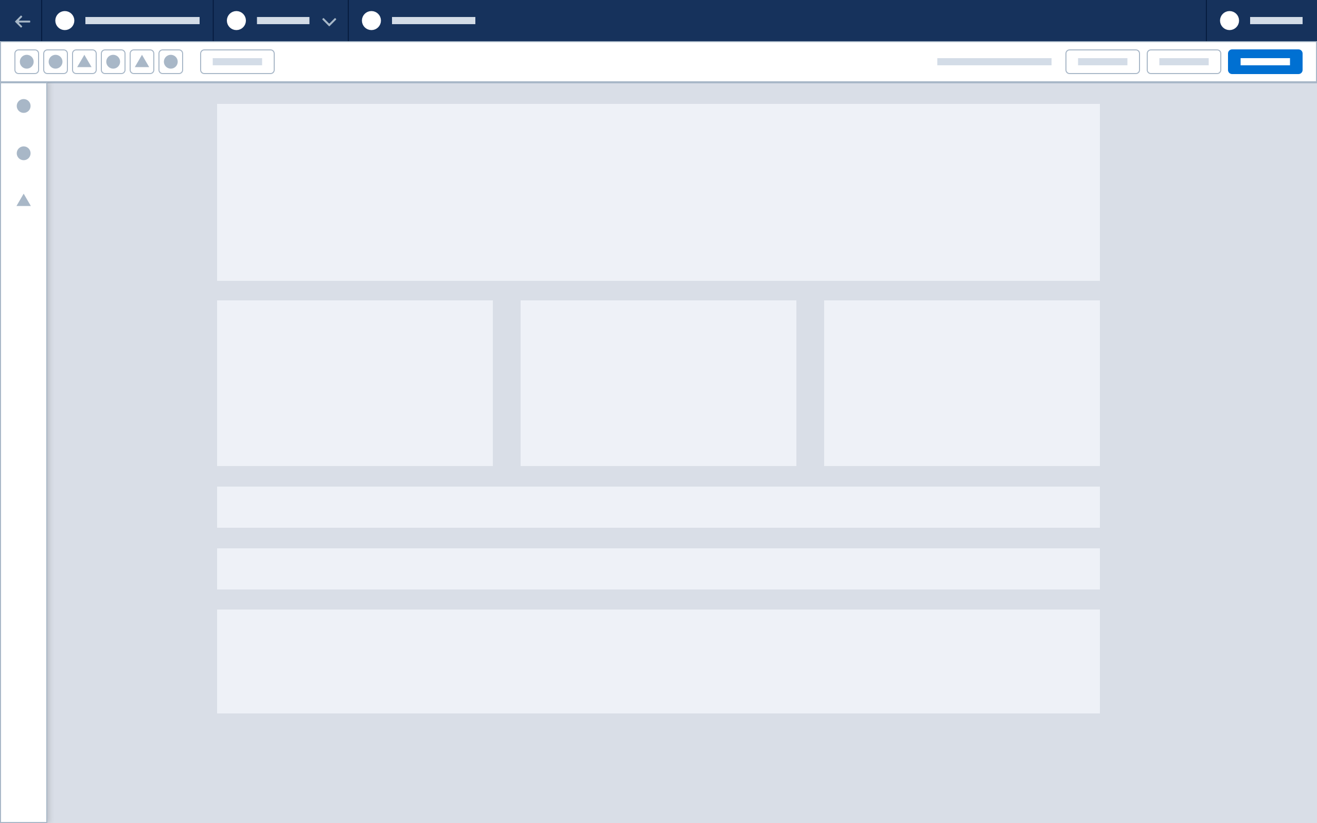
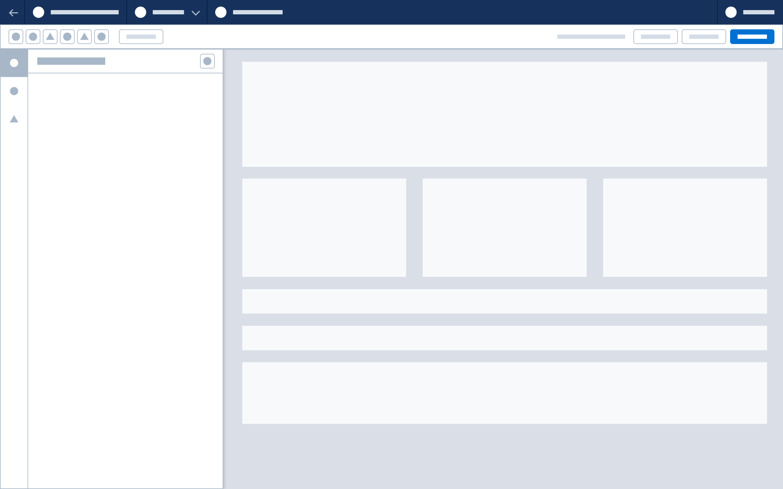
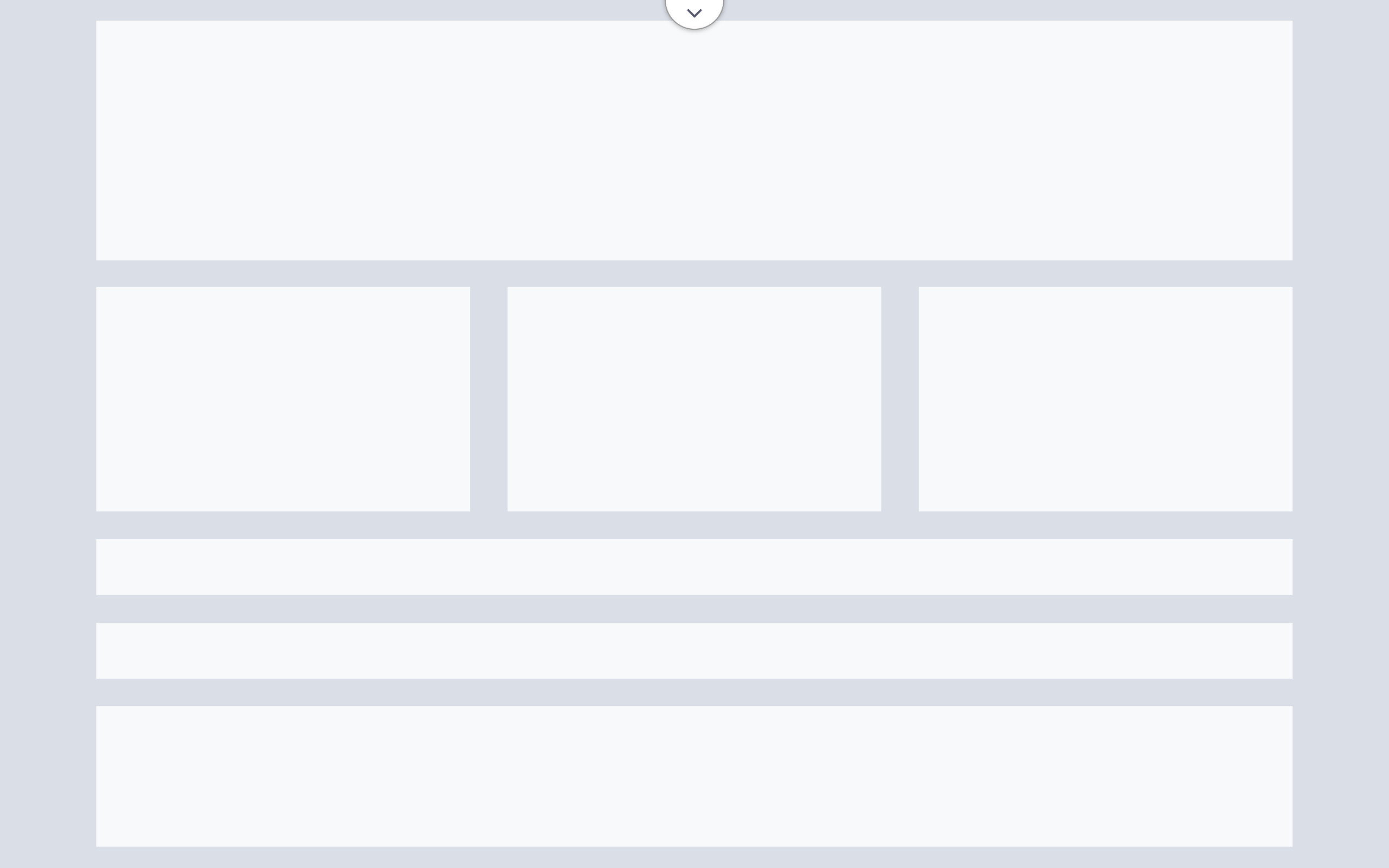
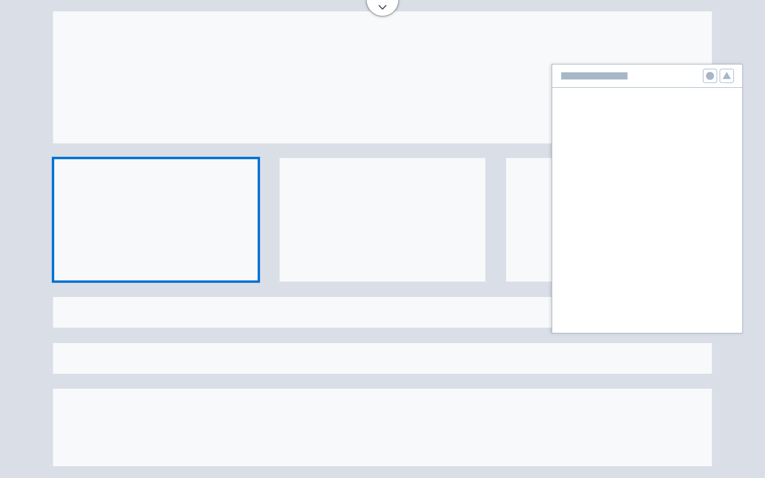
This configuration features a fixed left-hand panel and a floating property panel. Users can show or hide the left-hand panel; in both cases, a fixed left rail with icons is present. When the left panel is open, the canvas resizes to fit the available space. All panels and toolbars can be hidden, enabling content building on a full-window canvas.
A flexible panel allows for a larger canvas view. Flexible panel content builders include Experience Builder (community) and Page Designer (commerce). Flexible panels are:
- Ideal for builders used to create web pages and other large-scale content
- Ideal for viewing and testing responsive content
- Good for workflows that can benefit from more control over panel arrangement
Note that floating panels overlay the canvas when selected. If the entire canvas must be visible during configuration, use fixed panels.
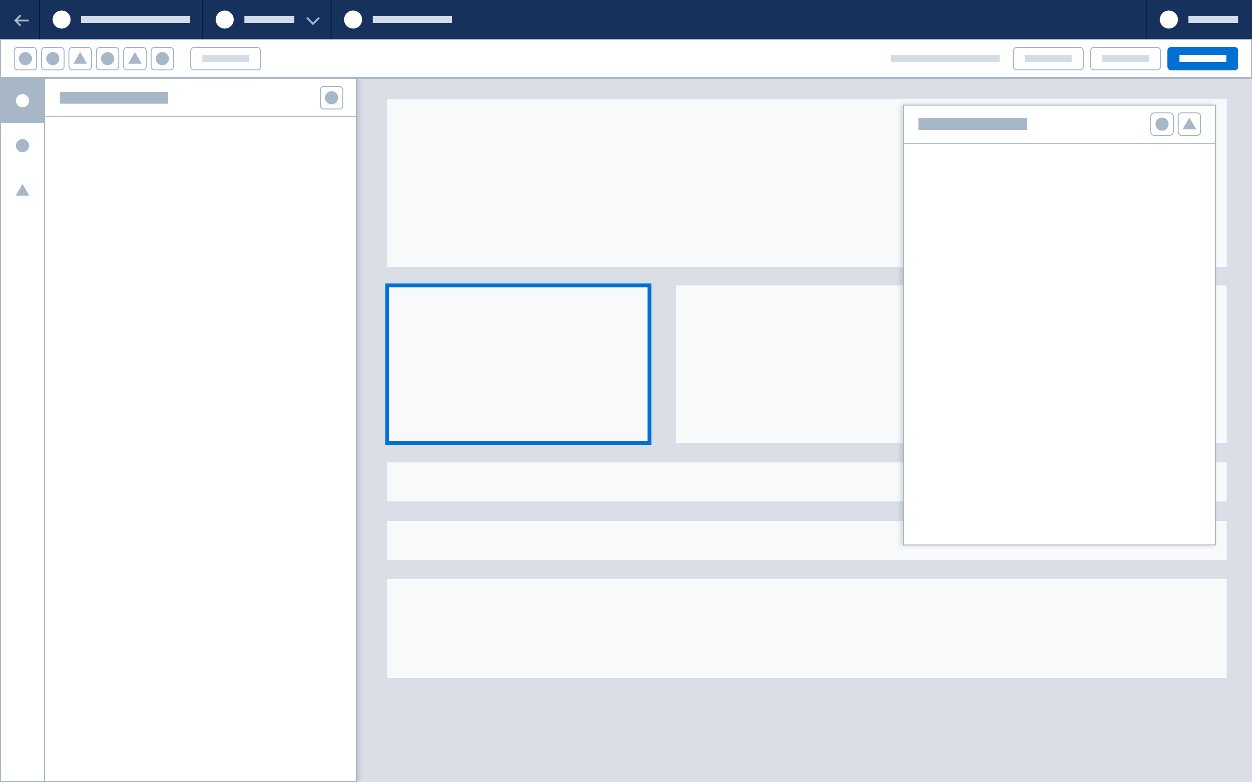
Accessibility Note: When implementing a flexible panel configuration, partner with engineering to specify and implement keyboard controls for floating panels.
Flexible Panel Configuration States

Next: Canvas