Modals
Modals
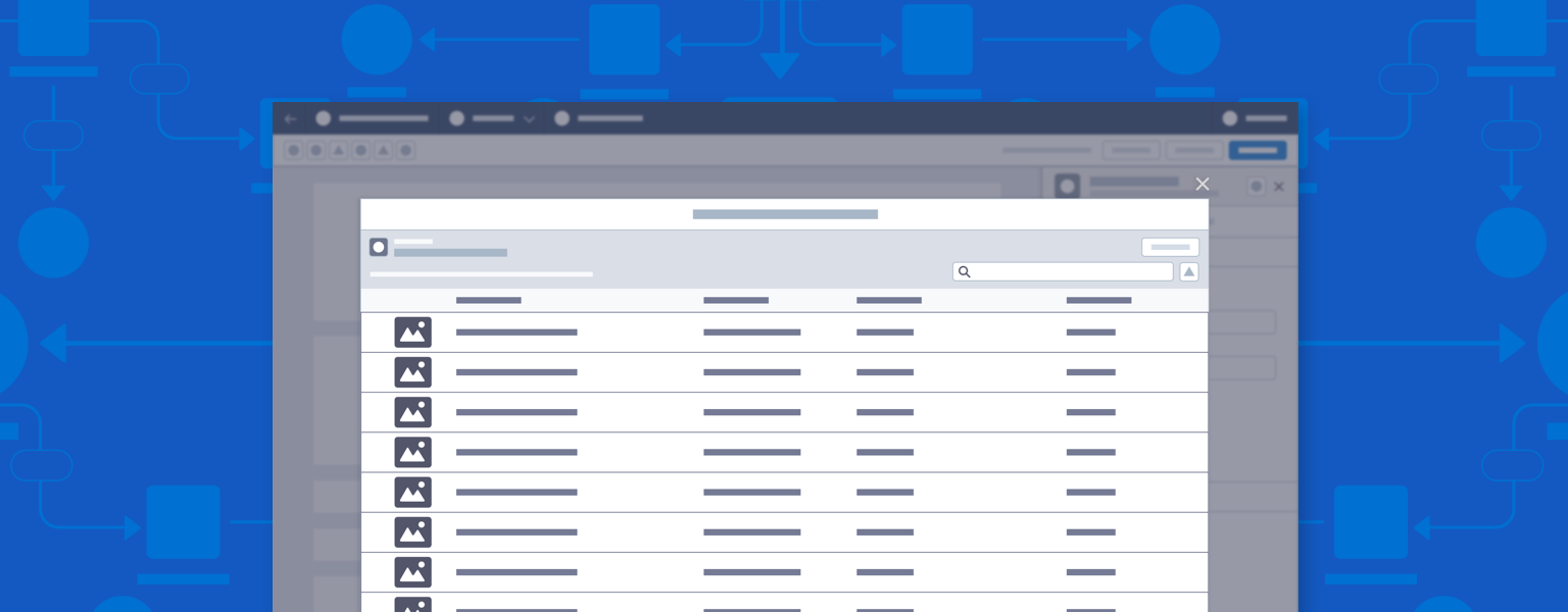
Modals display messaging and other content in a layer above the app.

Introduction
Modals display content in a layer above the app. They’re used for messaging, setup, and for viewing or editing additional details of the currently selected component or record.
Start using our Design Kits
Open in FigmaUsage
A builder can include both modals and panels. In general, panels are preferred over modals, though each has its uses. Use this decision matrix to guide your choices.
When to Use Panels or Modals
| Type | Pros | Cons |
|---|---|---|
| Panel |
|
|
| Modal |
|
|
See how modals can be used for specific use cases in Content Builders
Next: Nodes