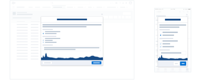
In App Feedback Patterns
Guidelines
Feedback mechanisms consist of question elements at the atomic level, which are brought together into a container that displays them to the user in the UI.

Overview
Often a combination of pattern elements will be the best solution to collect the most meaningful and actionable feedback for your use case. This section covers types of elements and containers, and best practices around when to use them depending on your research objective.
Start using our Design Kits
Open in FigmaPairing Questions and Elements
Once you have chosen your research objective, assess which element would provide the best experience for your users while also enabling you to capture meaningful feedback.
Use this table to help you select the right feedback element for each scenario.
| Elements | ||||||
|---|---|---|---|---|---|---|
| User Centric Questions | Rating Scale | Yes or No | Open Response Text Field | Multiple Choice Question | Visual Feedback | User Initiated Tagging |
| What do you think about this feature? Based on your visit today, how would you rate your overall experience using this feature? | Yes | Yes | Yes | Yes | Yes | |
| What were you hoping to have happend here? | Yes | Yes | Yes | Yes | ||
| Did you find what you were looking for? | Yes | Yes | Yes | Yes | Yes | |
| What was your goal today? Were you able to achieve it? | Yes | Yes | Yes | Yes | Yes | |
| How helpful was this recommendation? Is there any information missing from this page? | Yes | Yes | Yes | Yes | Yes | Yes |
| What's working well for you? Thinking about the last time you used this feature, what could have been improved? | Yes | Yes | Yes | Yes | ||
| What went wrong here? Help us understand what you were trying to do. | Yes | Yes | ||||
| If you could change, add or improve just one thing about our product, what would it be? | Yes | Yes | ||||
In App Feedback Question Elements
These guidelines include example question elements and their suggested usage. Think of them as mechanisms that you can adapt to meet your own needs.
Rating Scale
Overview
Numeric ratings are commonly used linear scale questions. They typically are scaled using whole numbers from 1-5 or 1-7. A notable exception is the Net Promotor Score (NPS) which is scaled from 0-10; this question however, has a unique method of analyzing results. Because the endpoints are more variable, the numeric rating scale offers more flexibility than the star rating scale. Stars are a commonly used visual, linear, rating scale question. One of the most common scales is 1-5 stars where 1 is low and 5 is high.
Usage
Numeric rating scales are often used for things like satisfaction, ease, brand favorability, feature importance, and likelihood to recommend.1 For ease of use, a statistically validated question called the Single Ease Question (SEQ) may immediately follow a task: Overall, how difficult or easy was the task to complete?
where 1 = Very Difficult and 7 = Very Easy. You might use a rating scale to ask a user to indicate how helpful a feature was, how helpful results or information presented felt, etc. They are used at the end of an experience, as an evaluative assessment.
Do label at least the endpoints of the numeric scale. Only use icon based rating scales, such as stars, for relatively simple evaluations. When assessing results, be careful of comparing averages without considering volume of responses.
Don't use non standard rating lengths (ex: 1-3, 1-9). For scenarios where the nuance is critical, don’t only use rating scales. To assess nuance, a rating needs to be paired with an accompanying qualitative element (much like a rating + comment option common to eCommerce experiences).

Yes or No Question
Overview
A simple, visual, or text based rating system to express a single sentiment, positive or negative, towards an element.
Usage
Yes or No votes are quick to complete, and can show at a glance sentiment. Results are often surfaced to users as a means of providing a visual cue as to the level of positive or negative sentiment about an element, such as an IdeaExchange idea. They can be icon or text based buttons and are used to answer a Yes/No question, such as Was this information helpful?
Do use voting for quick questions where there are two possible sentiments - yes/positive, no/negative.
Don't only use voting if there's the potential for more than yes/positive, no/negative. Capturing the gray area requires a qualitative element, such as Other
.

Open Response Text Field
Overview
Open response text allows users to provide a detailed response to a prompt. These fields are sometimes limited in length (ex: 1-2 sentences), which can indicate to users the type of response that is expected.
Usage
Use open response text when the set of likely possible responses is not known. For example, this can be used to understand reasoning behind a numeric rating, an opinion about a feature, or an explanation for an action.
Do use open response text fields for exploration, they can be a great tool for uncovering new insights.
Don't use open response text fields in excess; because they take time to complete, the likelihood of completion decreases as the number of open response text fields increases.

Multiple Choice Question
Overview
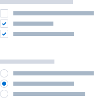
Multiple choice questions provide a concrete set of responses that a user can select. They can be either single or multi select.
Usage
Use multiple choice questions when the set of likely responses is known. Common multiple choice questions include age, industry, and current device. Multiple choice questions are often answered in the form of checkboxes or radio buttons
Do use multiple choice questions for quick data capture.
Don't use multiple choice questions for responses that are too similar, too long, or too complex.
Visual Feedback
Overview
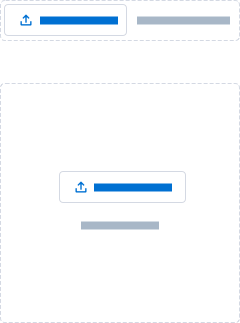
Visual feedback provides users the ability to highlight an issue within the product through showing with an image or screenshot in addition to telling through written feedback.
Usage
Use visual feedback when things such as layout or UI elements will be relevant to the information being provided, or when something can be more easily or quickly shown rather than described. This generally involves the user uploading a screen capture or other .png or .jpeg file to illustrate the issue or comment.
Do use visuals for helping to give further context to the feedback that a user is providing. Situations such as reporting a bug, factual error, or providing usability feedback benefit greatly from added visual feedback. This is best paired with an open response text field to allow the user to further explain the image that they have shared.
Don't use visual feedback to collect any type of personally identifying data about the customer or their organization that may unintentionally violate privacy mandates.
User Initiated Topic Tagging
Overview
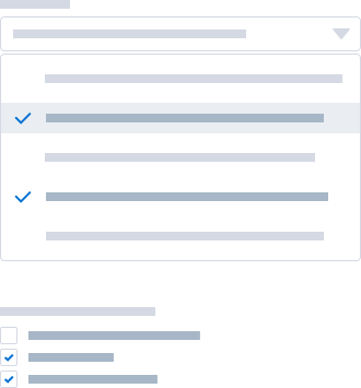
User initiated tagging is a mechanism that allows users to associate or tag their feedback with particular features or product areas in the system to help better explain the context of the feedback and improve analysis.
Usage
Use this when collecting more general feedback that needs to be associated to a particular flow, feature, or element of the system to have better context.
Do use tagging for allowing users to identify feature areas that their comments are about.
Don't create categories that are overly limiting to the user, this should be an optional field or the user should have the ability to choose “other” and fill in their own answer.
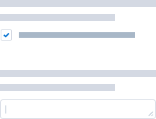
Consent Opt In
Overview
Consent opt in from users is an important part of collecting feedback in app. Depending on the nature of the feedback provided, how you plan to use the responses, or if you will contact participants for follow up there may be various legal requirements or needs for informed consent from participants to be able to take those next steps with the responses and data that they have provided.
Usage
Use consent opt in when you would like to contact a participant for follow up or additional research and to let them know how their data will be used. Consent opt in often takes the form of a checkbox or signature input that is paired with legal language that is relevant to the situation or type of information being collected. This often appears at the beginning or end of a set of research questions and should be required before the user is able to submit their feedback.
Do use consent opt in for the ability to follow up with a participant for further research sessions and to inform the participant of what they are legally agreeing to, and what their response is being used for.
Don't use consent opt in for collecting personal information that could identify users based on their responses or to collect confidential data from participants businesses.
1. Note: Insights for Rating Scale usage were sourced from https://measuringu.com/rating-scales/
Feedback Containers
A container is a component that brings together question elements at the atomic level and displays them to the user in the UI.
Pairing Elements and Containers
Once you have chosen specific question elements to align with your research objective, assess which container would provide the best experience for your users while also enabling you to capture meaningful feedback.
Use this table to help you select the right feedback container based on the elements that you are using.
| Containers | |||||
|---|---|---|---|---|---|
| Elements | Inline | Docker Composer | Popover | Full Page | Modal |
| Rating Scale | Yes | Yes | Yes | Yes | Yes |
| Yes or No | Yes | Yes | |||
| Open Response Text Field | Yes | Yes | Yes | ||
| Multiple Choice Question | Yes | Yes | Yes | Yes | |
| Visual Feedback | Yes | Yes | Yes | ||
| User Initiated Topic Tagging | Yes | Yes | Yes | ||
| Consent Opt In | Yes | Yes | Yes | Yes | Yes |
In App Feedback Containers
These guidelines include example containers and their suggested usage. Think of them as mechanisms that you can adapt to meet your own needs.
Inline
Usage
Inline feedback persists on the UI and it is used to collect a response to short surveys, such as helpful or not
, about relevant information in the same section. It’s displayed inline and doesn’t block any other part of the interface, or disrupt a user’s task flow.
Docked Composer and Half Sheet
Usage
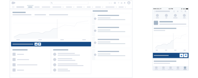
A docked composer is a persistent utility bar that can expand or collapse a composer window on desktop. It allows us to gather feedback from users without disrupting them continually using the app to complete tasks. A docked composer could surface the same survey across multiple pages. A half sheet serves a similar function in the mobile space though can be a bit more disruptive to users.
Popover
Usage
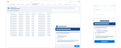
A popover is a non modal dialog opened by a clickable trigger element. It is used to display contextual surveys without having a layer cover the app. A popover contains a simple survey that usually does not require multiple steps/pages.
Full Page
Usage
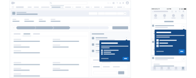
A full page has the most space to display a survey. Usually this is for questions that will require taking the user's attention away from their current tasks. Be sure that the user is opting in to give additional feedback and understands that they will be redirected from their current workflow to a separate full page. Depending on the level of detail you seek to collect, the survey could be presented in multiple steps or pages.

Modal
Usage
Modals display a fair amount of the content in a layer above the app. A modal is used when a survey needs to be shown without the user losing the page context, and allows them to easily return to the underlying page after the form is submitted or dismissed. Paired with a progress indicator, a feedback form could be displayed progressively in the modal.
