Empty State
Empty states tell users that there’s no content to display—and what they can do next.
Introduction
Empty states are messages that appear whenever an element has no content to display to the user. They can appear anywhere in Salesforce, in both desktop and mobile interfaces. They can alert users to empty search results, unconfigured features, or, in some cases, errors. They can even appear to tell users that an empty area has been intentionally left blank.
Start using our Design Kits
Open in FigmaSee the Illustration component blueprint for implementation information
Usage
An empty state is a means to communicate with users. It should tell users what it’s for, why they’re seeing it—and what they can do next.
It’s also an opportunity to engage users, adding energy and motivating them to interact. It can guide users through an onboarding process or help them get more value from Salesforce, without overwhelming them with too much information at once. And it’s a great way to reinforce our brand while injecting a bit of fun and Ohana spirit into the user experience.
When designing an empty state, consider how well it will work for desktop and mobile use cases. For example, will it be used in both environments, or just one? Does the call to action apply for mobile users? How will the image work on a small screen?
Parts
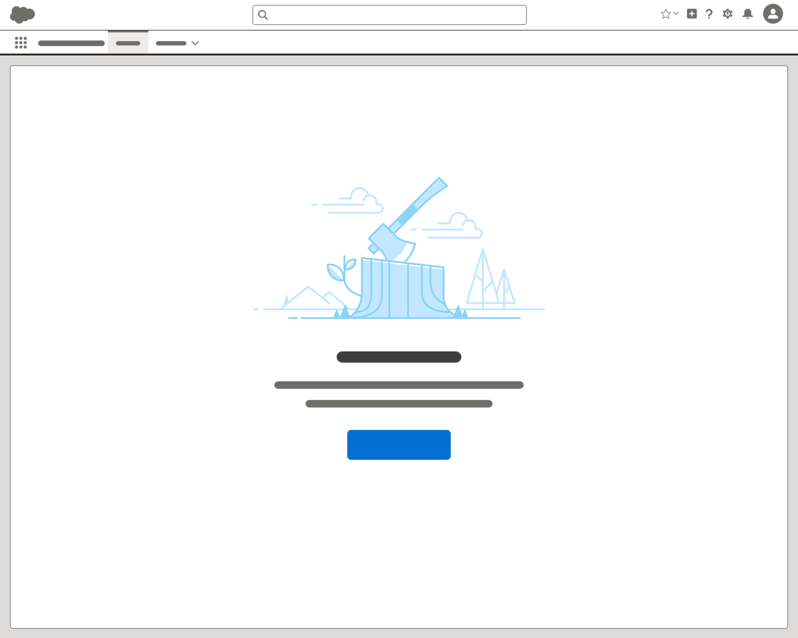
Each empty state must have a message. A call to action and illustration are optional.
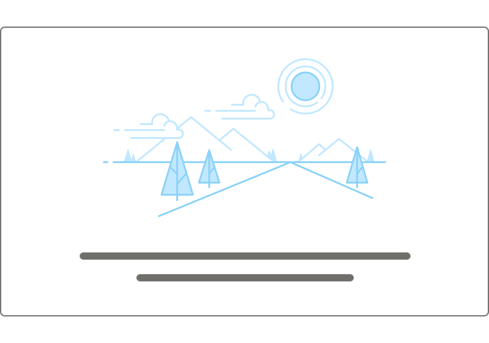
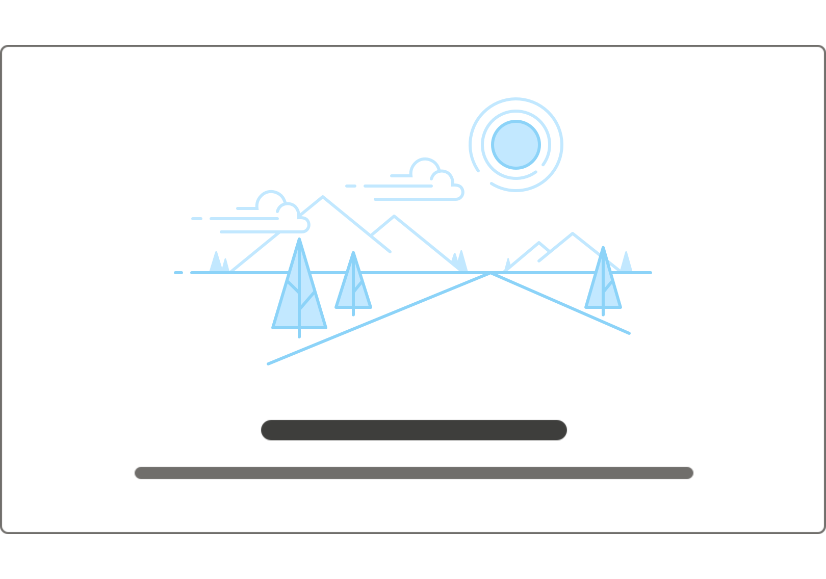
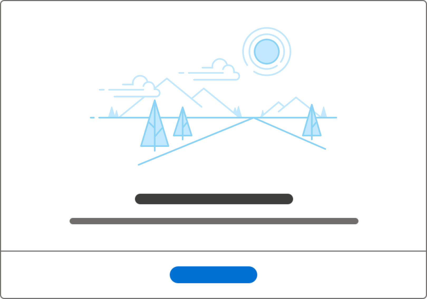
Message
Overview
An empty state message consists of two pieces:
- The headline offers an opportunity to convey more information while adding some fun.
- Body text adds details and engages users.
For readability, keep line length for each of these pieces under 66 characters per line. In general, try to keep the line length the width of your illustration. Please consider localization when writing copy that may cause wrapping to another line when localized.
Usage
Make sure the message, call to action, and illustration work together. Don’t reserve fun for illustrations—convey it through writing too. And if an image changes, work with any writers involved to keep image and text in sync.
Some guidelines to help you produce strong empty state messaging:
- The headline should start with a verb. Use the friendly, approachable Trailhead voice and tone.
- Body text should be short and informative, telling the user what’s happening. Keep the tone consistent.
Call to Action
Overview
A CTA stands for call to action. It's a button that draws attention to the most logical action. A CTA helps users move from an empty state to a situation where the page, component, or element at hand is useful to them.
CTAs are optional, but helpful. They should be as specific as possible, answering the question What should the user do next?
Usage
When writing a CTA, consider the user’s most likely next best action. A CTA could let the user (in order of preference):
- Click to take the action now
- Launch a way to help “fill” the empty state
- Launch a walkthrough that teaches the user about the feature
- Launch a Trailhead module in a new tab
- Launch a related Help topic in a new tab
You might also have no CTA—not all situations have a clear next step.
Some considerations when choosing a CTA:
- Many platform features are limited by permissions. Will all the users seeing your CTA have permission to take the action? If not, consider a more universal CTA, or none at all.
- Is this empty state a teaching moment, or is quick action more important? If it’s an action users are likely to do often (e.g., creating a new record), point to the primary method of completing that action so they can learn. If it’s more of a one-off, open a modal or other shortcut.
- Do you need two CTAs? One’s usually enough, but occasionally you’ll want a primary CTA that helps the user “fill” the empty state, plus a second to provide context or point to learning opportunities. In cases where a second CTA is useful, it should be placed immediately after the body text (or in place of the body text if there isn’t any).
- Don’t repeat the headline in the CTA.
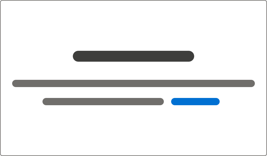
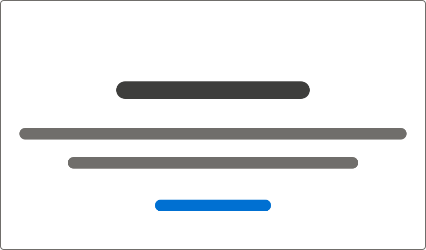
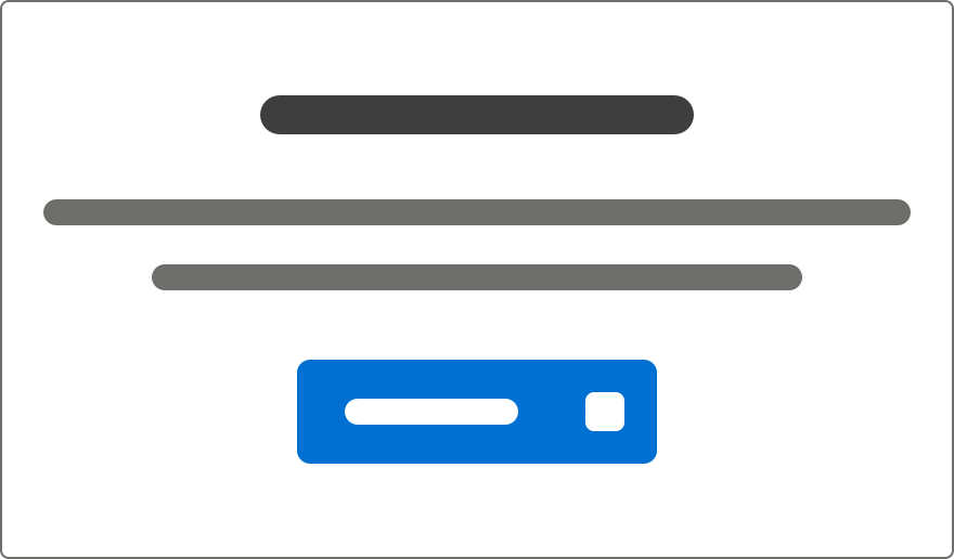
Some options for CTA placement:
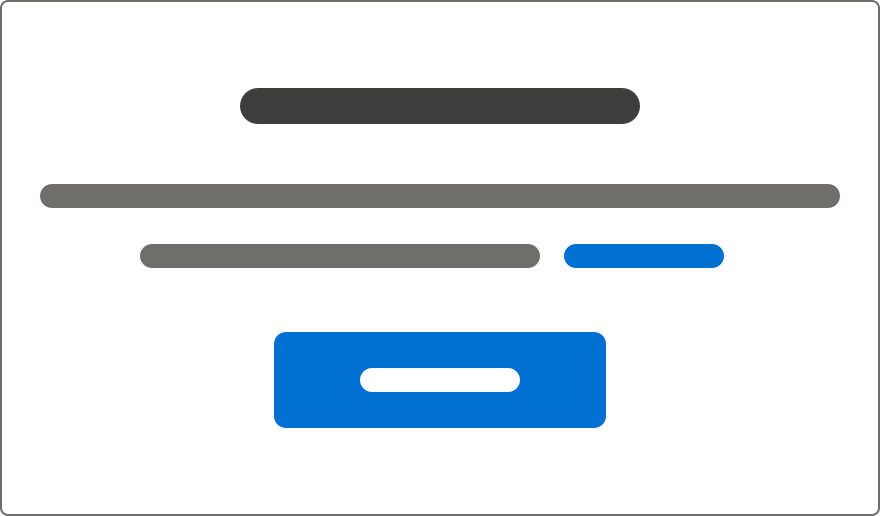
- Text link, immediately after the message.
- Text link, visually separated from the message.
- Text link + icon, visually separated from the message.
- With two CTAs, separate the primary CTA from the message, and put the secondary CTA immediately after the message. Never use more than two CTAs.
Illustration
Overview
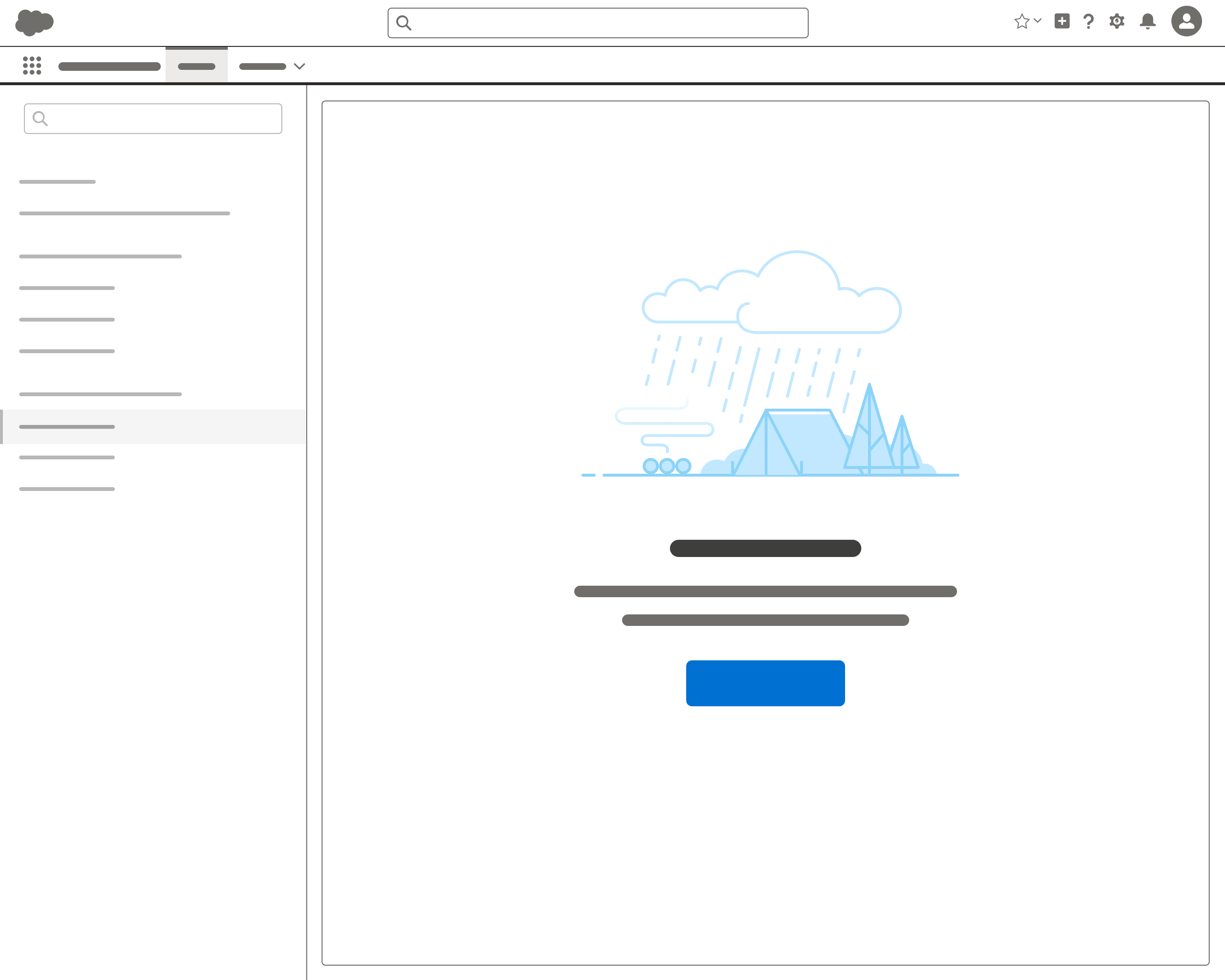
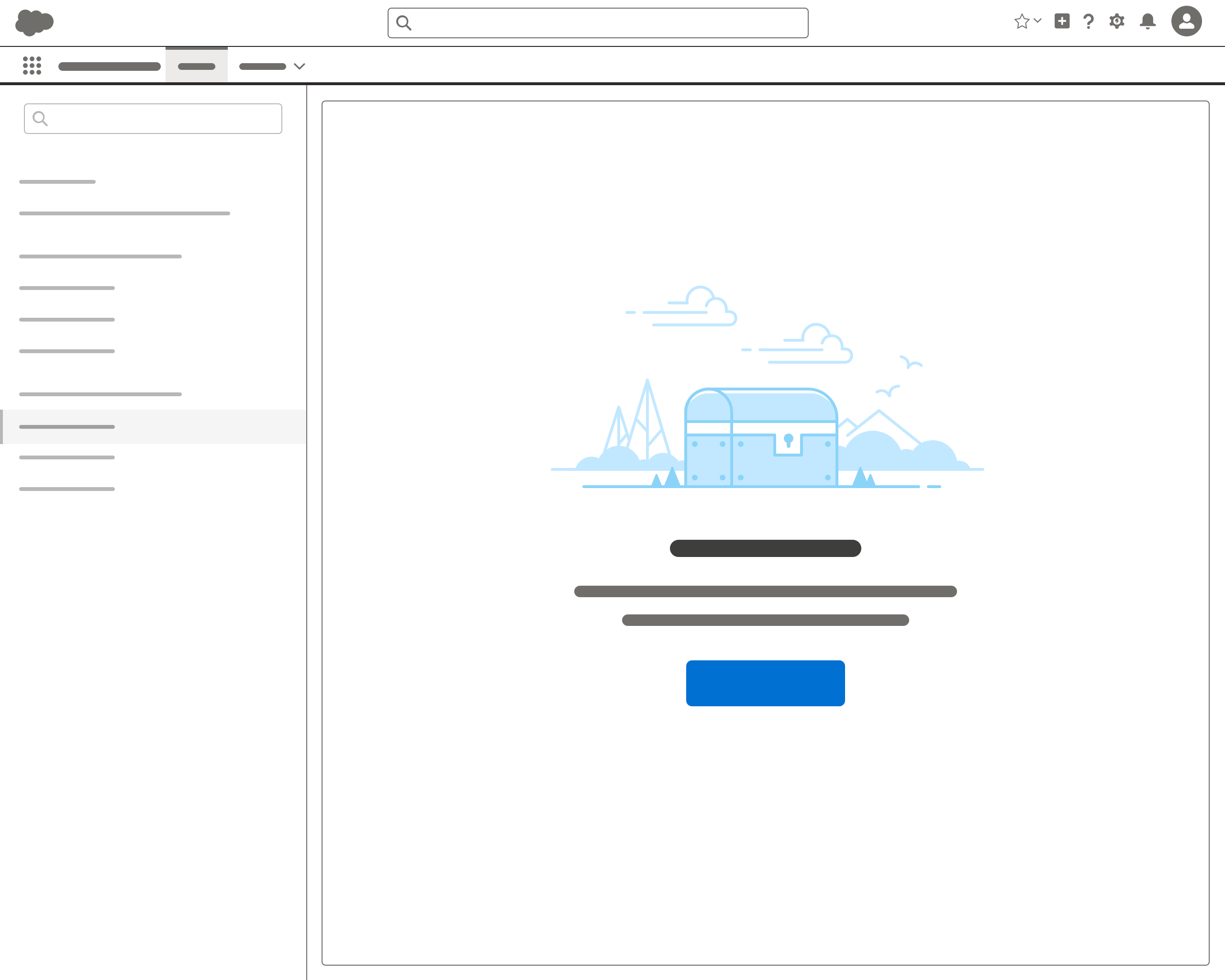
For empty states, illustrations are optional—but they’re a great way to add a touch of fun and visual interest while helping users understand their situation.
Usage
Use illustrations judiciously—too many can be busy and confusing.
Create a new illustration only if you can’t find an existing one that works.
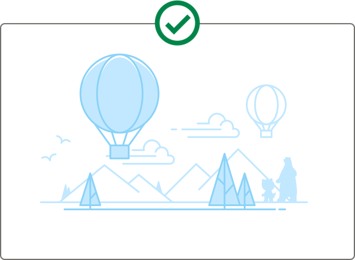
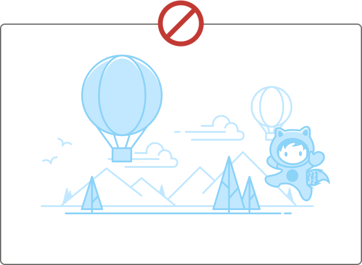
- Choose illustrations that are fun and support the situation. They should be able to stand on their own without characters.
- Don’t make Salesforce characters the focus of your illustration. Because Salesforce orgs can be themed, characters should live only in the background, as outlines—your illustrations should be able to be understood without them.
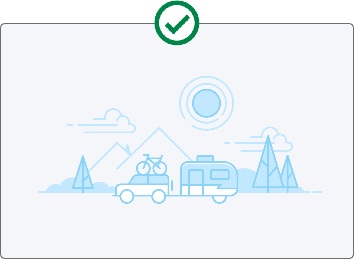
When an empty state illustration has a colored background:
- Keep white fills in foreground objects
- Don’t remove fills from objects
- Never have a white fill as the background
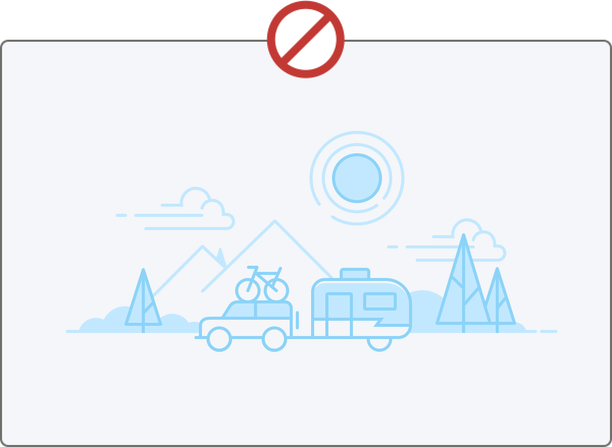
Sometimes, an illustration is not needed. An illustration should clarify the situation. If your image doesn’t add anything to the user’s understanding, skip it. Some examples where no illustration may be the right call:
- When components are used inside other components
- When it's not possible to create an illustration that adds clarity isn’t possible
- When using components that are likely to appear with many other empty components
When an illustration is warranted, use the right size for the context.
- Use a large illustration when the empty state is likely to be the only thing on the page, or the primary focus—for example, on Setup pages.
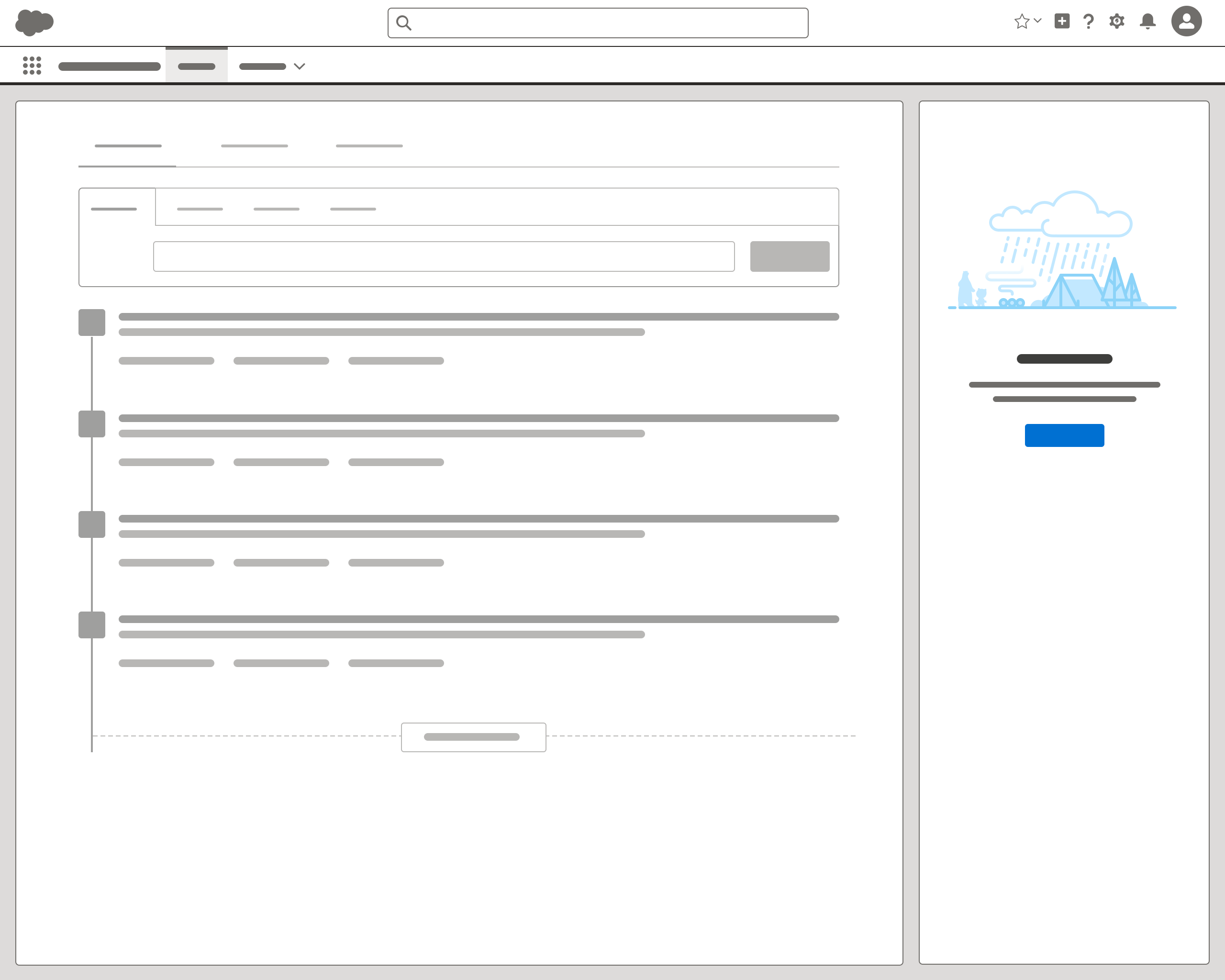
- Use a small illustration when you’ll have multiple empty states on a page, or if the component will be used on multiple pages.
- An illustration can exist as a full page, in the main body or sidebar of a page, or in a component.
