Popover
Guidelines
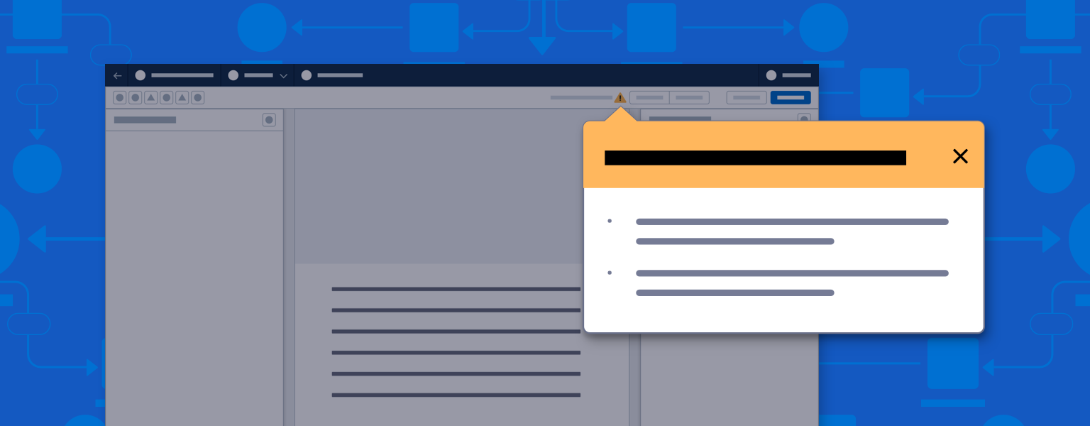
A popover presents information on whatever it points to on the canvas.
Introduction
Popovers are nonmodal dialogs that give the user contextual information and actions on canvas elements, and message users about errors and warnings.
Start using our Design Kits
Open in FigmaUsage
Clicking a popover’s trigger element or node opens the popover, and either highlights relevant information or provides actions against the trigger element.
All popover messages must be:
- Dynamically generated (based on builder file contents, with no static messages)
- Actionable (the user can take action against the element)
Error Popover Variant
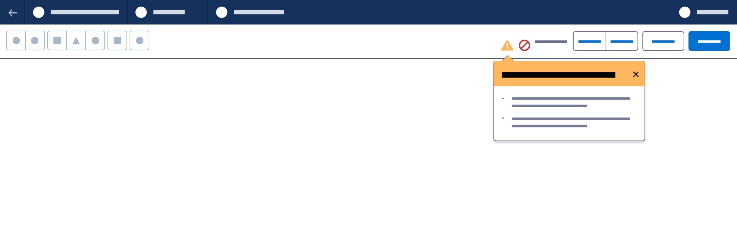
Any error that prevents a builder from being saved should appear in a toolbar popover.
Error messages include header text on a red background; footers are optional.

Warning Popover Variant
Any issue that prevents a builder from being activated or published, or prevents runtime, should appear in a toolbar popover.
Warning popovers include header text on a gold background; footers are optional.
Panel Information Variant
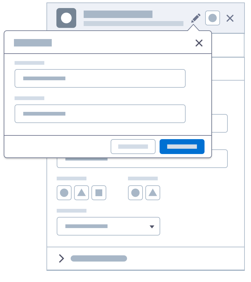
This popover variant provides contextual editing for the name and description of a component in a panel header.
Click to Create Variant
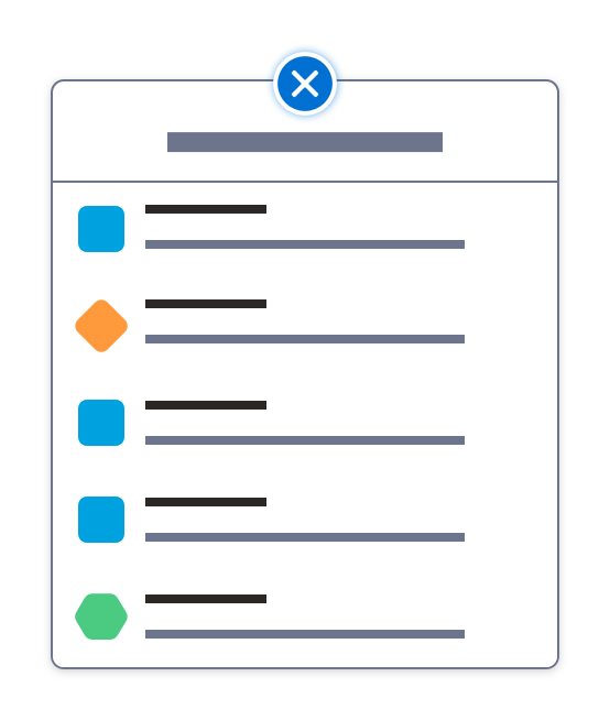
This popover variant lets users build workflows by selecting nodes, connectors, and other workflow elements from its menu. The “add” icon rotates 45° to look like a “close” icon when the popover is open, in addition to other animation changes.
List Menu
The list menu layout presents options visually.
Visual Menu
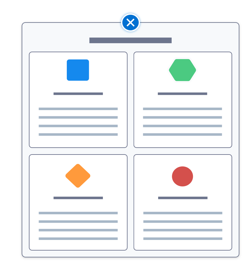
The tile menu layout lets users select from a limited number of options.
Drill-in
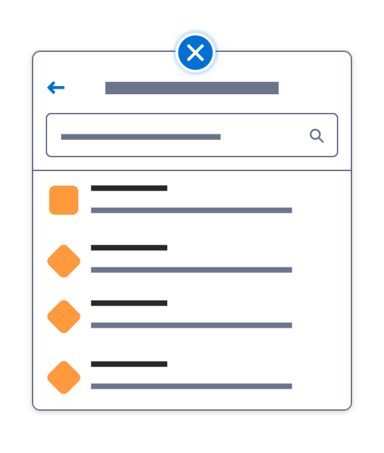
For longer, nested option menus, add a drill-in and a search input. A back button lets users navigate branches of the original menu.
Test Mode Variant
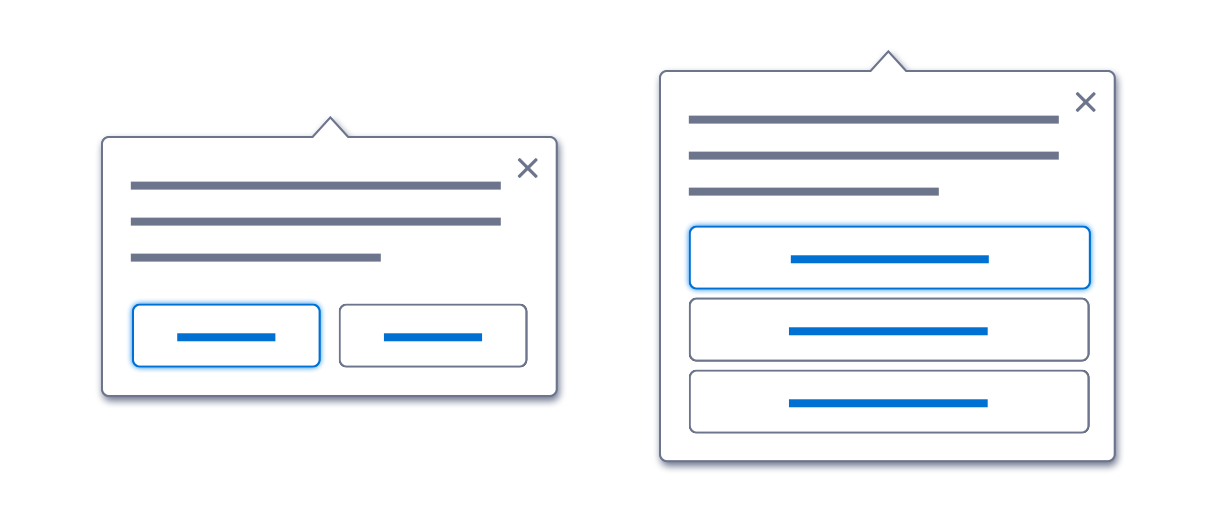
In manual workflow testing, users evaluate paths for logic and flow. At each decision point, a popover offers options (for example, an audience group or an event). To present two options, use two buttons side by side. For three to four options, stack the option buttons. For five or more options, add a scroll bar.
Next: Validation