Toasts
Guidelines
Toast serves as a feedback & confirmation mechanism after the user takes an action.
Usage

- Visual: Visible
- Voice & Tone: Informational
- Motion: Delicate
- Duration: Dismissible
- Audio: Soft (or Vibrate)
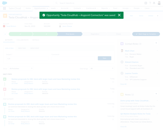
A toast appears in reaction to user action: creating, editing, deleting. For example, a user edits an opportunity via a modal and saves it. The modal closes and the toast appears at the top of the opportunity detail page.
A toast can show one of the following states:
- Error: when a user completes an action, but system-related issues prevent the action to be truly executed.
- Informational: when a user completes an action, but there are some additional info to be shown.
- Success: when a user completes/executes an action.
- Warning: when a user cannot complete an action due to external factors (e.g. permission) rather than something they can fix right away (e.g. form error).
Toasts persist at the top of the page regardless of scrolling, and they are visible until a user dismisses them or the defined duration elapses. They show 1–2 full sentences (no truncation), including an inline link (when appropriate), and an X to close. Toasts on desktop include an icon denoting the type of message, but toasts on mobile don’t include one.
The width of a toast is determined by the length of its content and its inside padding, but at minimum it should be 480 px and centered within the canvas of the page.
Toast in Context


Dos and Don’ts
DO
- Do batch toasts of the same type to minimize the number of toasts that appear.
- Do stack multiple toasts if you have more than one type appearing. Show the most recent on top and the rest underneath it in chronological order.
Do Not
- Do not use toasts to confirm success when a create action brings the user to the newly created item. For example, creating a new record from a list view leads to the new record, so a toast is unnecessary.
- Do not show toasts after inline edit. Returning to view state is indication enough that the changes were successfully submitted—if the form didn’t save properly, it would still be open (+ error popover & message).
- Do not keep toasts after the user navigates away. A toast displays status that’s only relevant to the current page they are on; if they move to a different page, the toast message is no longer relevant.
Variants - Component
“Holiday Campaign 2016” was updated.
“Holiday Campaign 2016” was updated.
258 contacts were already added and they remained as is.
Variants - State
Can’t save lead “Sally Wong” because another lead has the same name.
26 potential duplicate leads were found. Select Leads to Merge.
Account ACME - 100 widgets was created.
Can’t share file “report-q3.pdf” with the selected users.
Variants - Screen Size
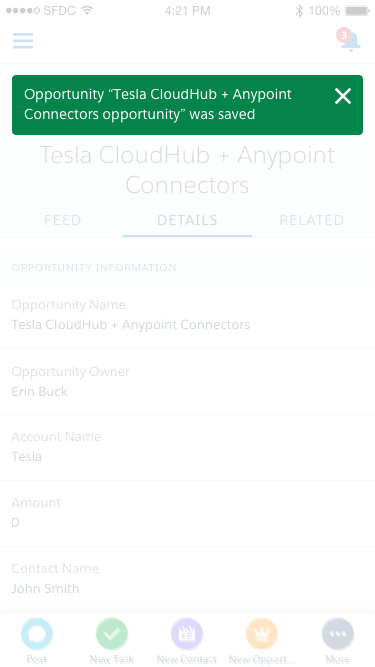
Opportunity “Tesla CloudHub + Anypoint Connectors - 300 widgets” was saved.
- 90% width
- No icon
- Smaller, left-aligned text
- No description text
UI Text
Basic rules around UI text in toast:
- The syntax is as follows:
«record type» «record name» was/were «past tense action» - If the action is create a record, the newly created record should be linked. Otherwise, the affected record should be shown inside quotation marks, but not linked.
- If the action affects multiple recipients, the first one should be listed, and the rest should be shown as “X others” and linked.
| State | User Action | Example |
|---|---|---|
| Informational | Create a record with potential duplicates | |
| Warning | Share a file (but there are external issues) | |
| Error | Save a record (but the system cannot execute) | |
| Success | Create a record | |
| Success | Edit a record | |
| Success | Delete a record | |
| Success | Clone a record | |
| Success | Share a file (multiple recipients) | |
| Success | Send an email (multiple recipients) |
Accessibility & Recommended Specs
Refer to this code sample for the toast markup.
All Toasts need to have a close “x” icon button so that users can dismiss them. All Toasts should persist (be sticky) until the user closes it except for the Success Toast without a link. Success Toasts can auto-dismiss after 3-5 seconds
When Toasts appear, keyboard focus should not move to them. Users should press Cmd + F6 to quickly jump between the main app and the toast container if they want to access any links inside the Toast or dismiss it.

